
Tuff Shed
2015
One of the projects I was most excited about in 2015 was the opportunity to work with Colorado based Tuff Shed on 2 custom outdoor illustrations which showcased their new Cabin Shells. After meeting with Tuff Shed's Creative Director, Tony Thielen, to learn about the amazing variety and versatility of the cabin shells, I was chomping at the bit to work on visuals which would showcase the cabins in a unique way.
Tony sent a thorough and well thought out brief which called for 2 illustrations: one featuring a couple's retreat and another a family getaway. I've included a writeup on each of them to give you a peak at the creative process which goes into these illustrations.
Process
My process for creating illustrations like this is fairly linear: thumbnails on paper, digital sketches, flats, color, final. I typically work exclusively in Photoshop, though I'll occasionally use Illustrator if there is figure work or complex architecture involved. What was unique about my process for these pieces was the use of my brand new Wacom Cintiq Companion 2. Prior to the Companion 2, I was working on a full size Wacom Cintiq which was getting very old and needed to be replaced. I'll do a more thorough review of the Companion 2 later.
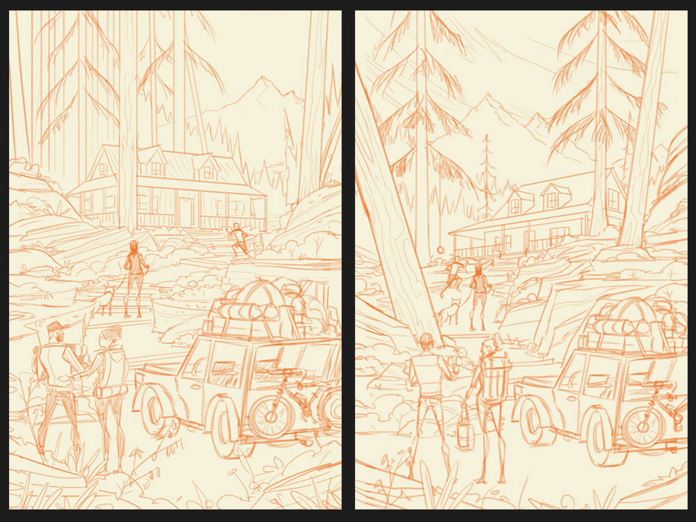
Family Vacation
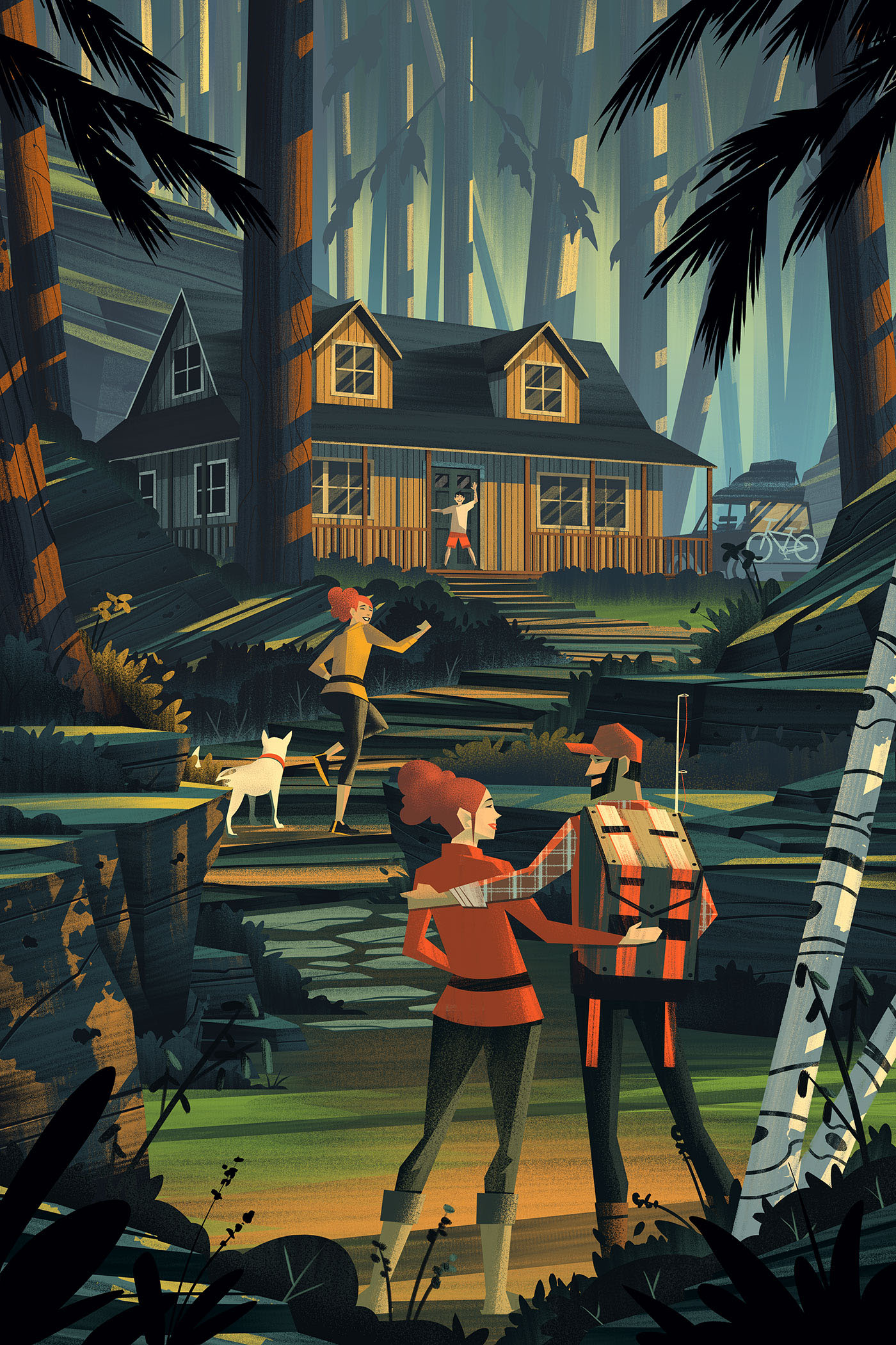
Sketches
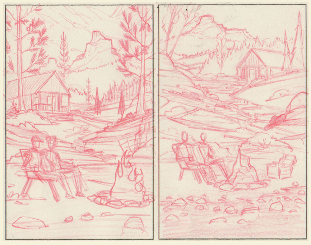
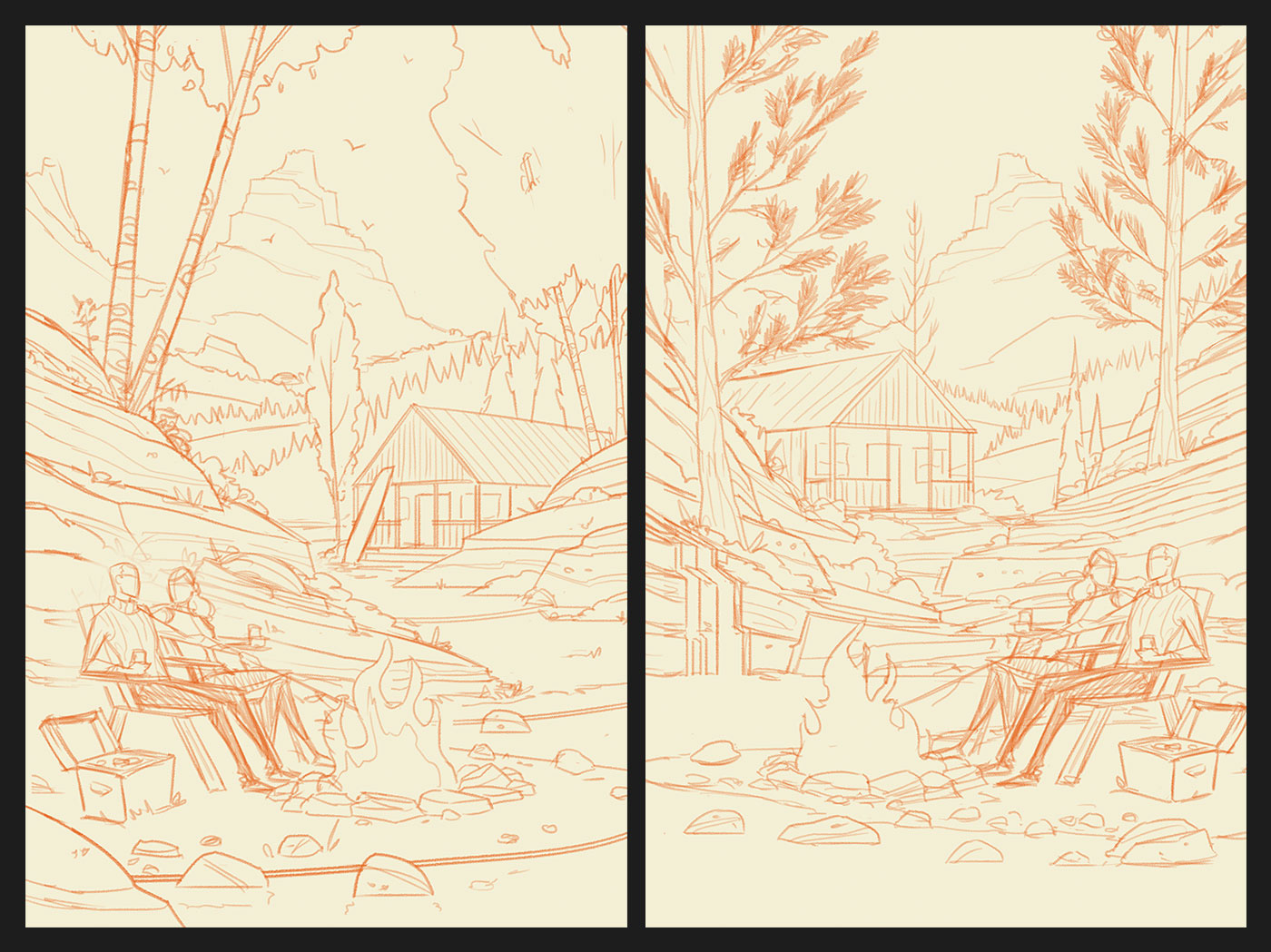
The first piece I tackled was the illustration for the Family Vacation. There was a lot to work out with this piece as far as the composition was concerned so I did a few explorations using my trusty Col-Erase Red pencils on a piece of paper. I find working with very small thumbnail compositions (no more than 2-4" tall / wide) is the best way for me to brainstorm ideas without going too far down a single path. This saves time and helps me to find the best solution given the constraints and requirements.
The first piece I tackled was the illustration for the Family Vacation. There was a lot to work out with this piece as far as the composition was concerned so I did a few explorations using my trusty Col-Erase Red pencils on a piece of paper. I find working with very small thumbnail compositions (no more than 2-4" tall / wide) is the best way for me to brainstorm ideas without going too far down a single path. This saves time and helps me to find the best solution given the constraints and requirements.

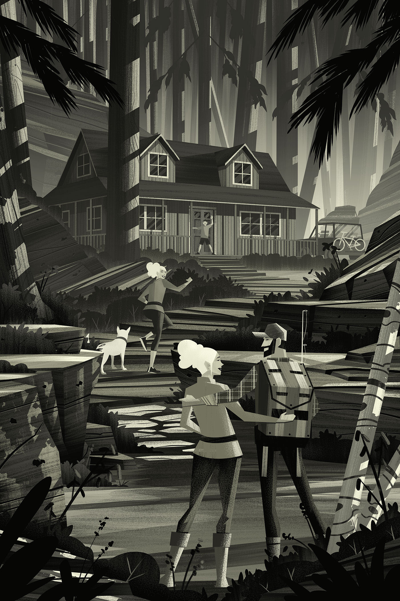
Flats
With the sketch worked out and approved, it was time to get into serious production mode - my favorite! As per my typical process, I worked in black and white values to establish my lighting, textures, and shapes. One of the areas I wanted to focus on with these pieces was to push my shapes and style. The great thing about working in black and white up front is it afforded me total focus on one element at a time. Once the flats were established, this is what I had in front of me:
With the sketch worked out and approved, it was time to get into serious production mode - my favorite! As per my typical process, I worked in black and white values to establish my lighting, textures, and shapes. One of the areas I wanted to focus on with these pieces was to push my shapes and style. The great thing about working in black and white up front is it afforded me total focus on one element at a time. Once the flats were established, this is what I had in front of me:
Color
When the flats are working just the way I want them to, I know its time to move into color. I truly enjoy saving this part for the end because the exploration of color is very rewarding in and of itself.
When the flats are working just the way I want them to, I know its time to move into color. I truly enjoy saving this part for the end because the exploration of color is very rewarding in and of itself.
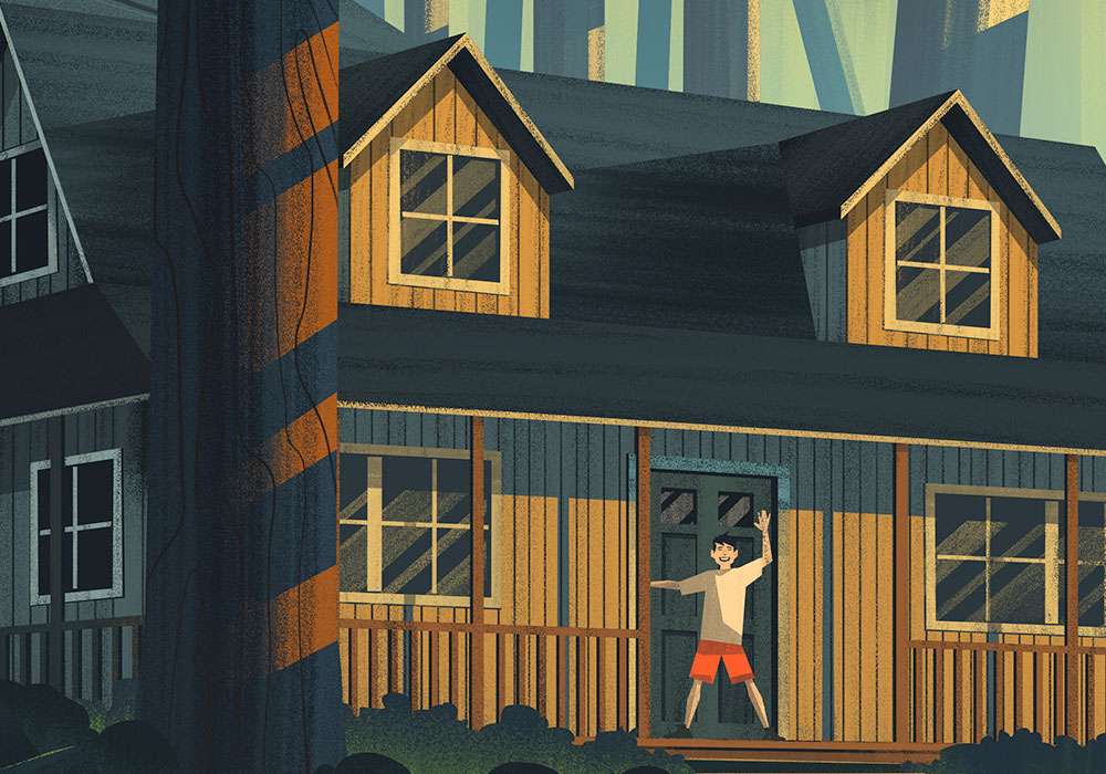
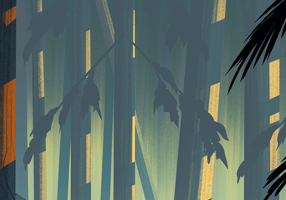
Here are a few detail shots to give you a close-up look:

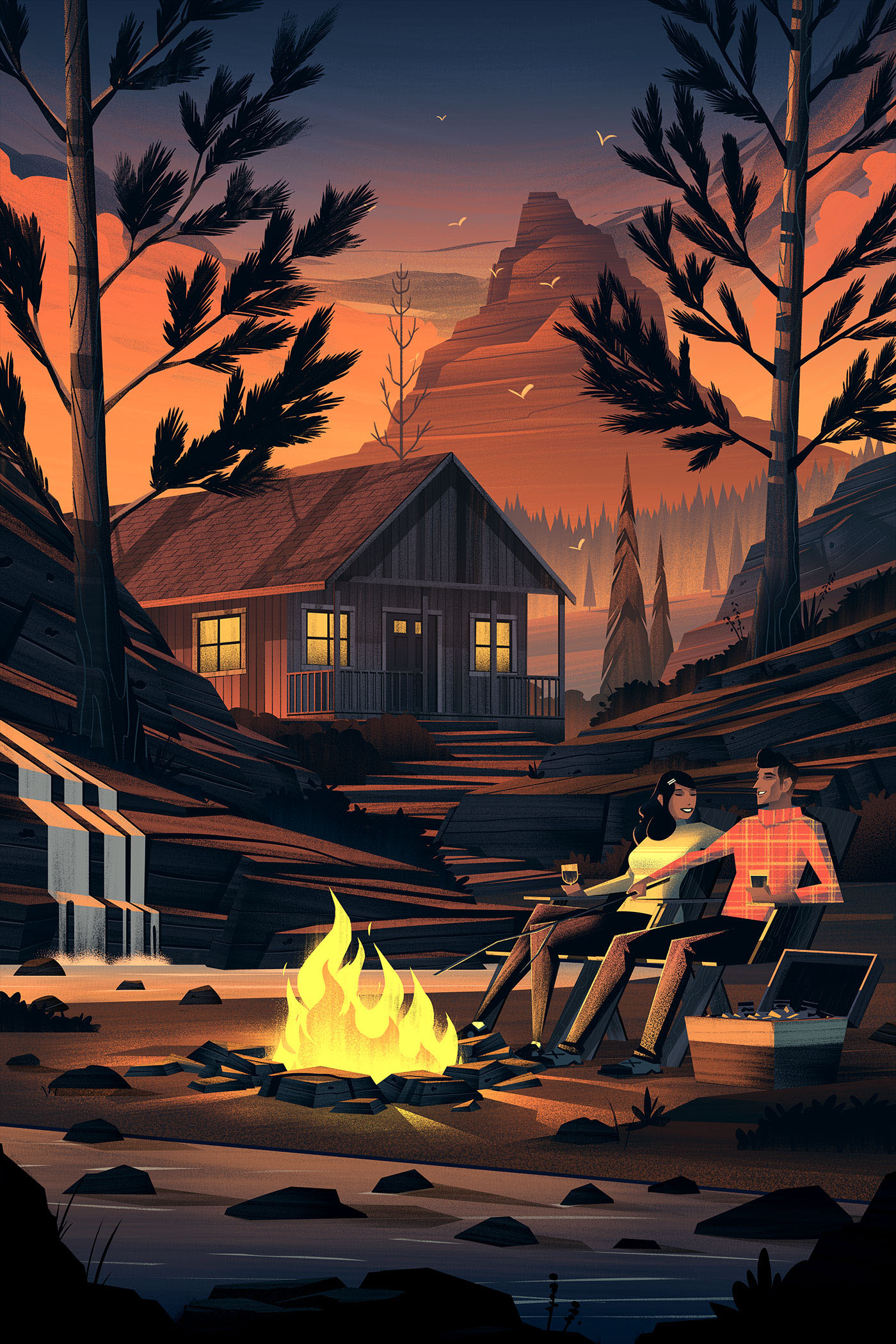
Couples Retreat
Sketches
Next up was the Couples Retreat illustration. There were a handful of items needing to be shown (the cabin, a shore, the couple, etc.) so I took to sketches to work out the composition.
Next up was the Couples Retreat illustration. There were a handful of items needing to be shown (the cabin, a shore, the couple, etc.) so I took to sketches to work out the composition.
Flats
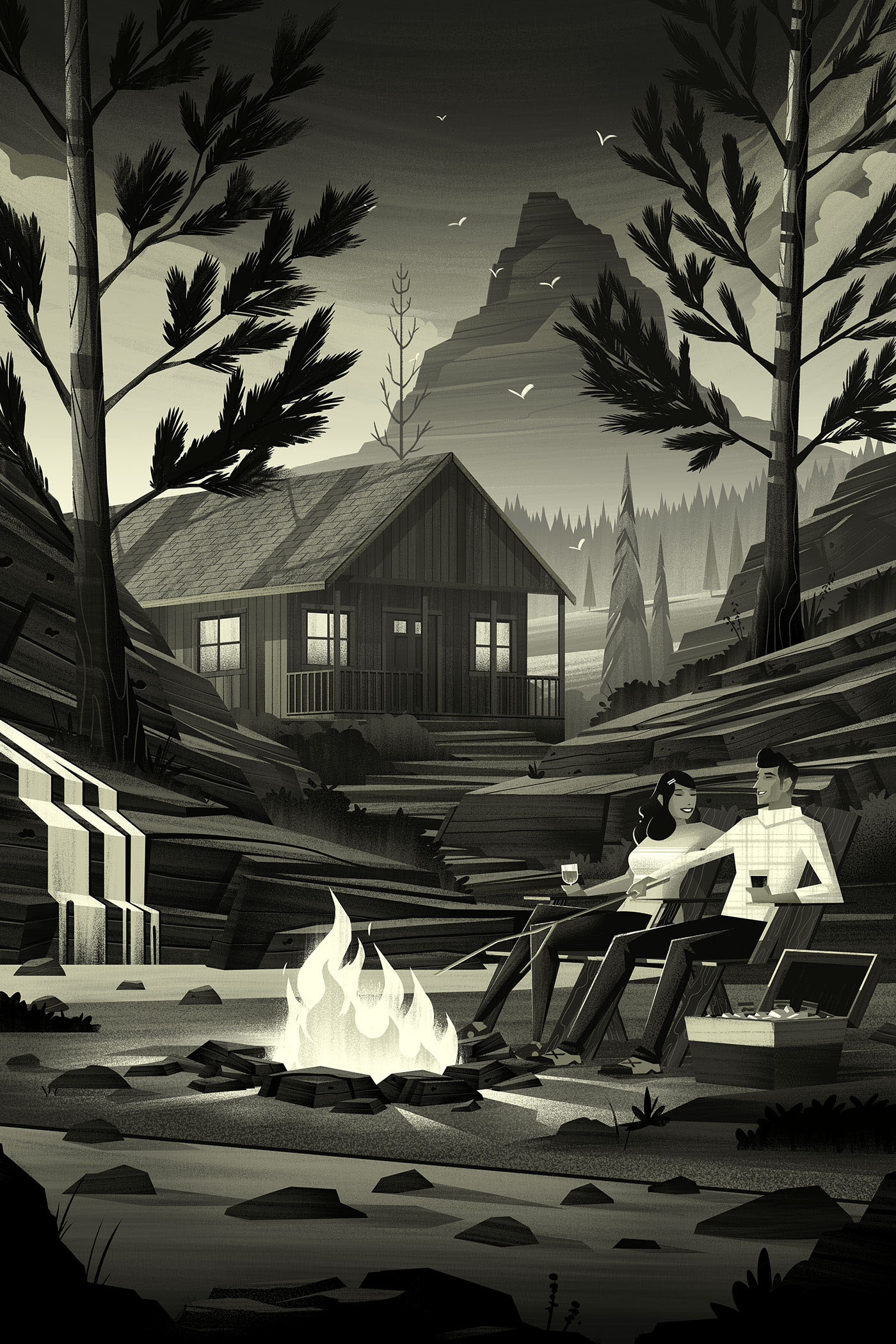
As I did in the first piece, it was now time to move into flatting. I really enjoyed this part of the process for this piece, especially with the strong shapes in the background, mid-ground, and foreground.
As I did in the first piece, it was now time to move into flatting. I really enjoyed this part of the process for this piece, especially with the strong shapes in the background, mid-ground, and foreground.
Color
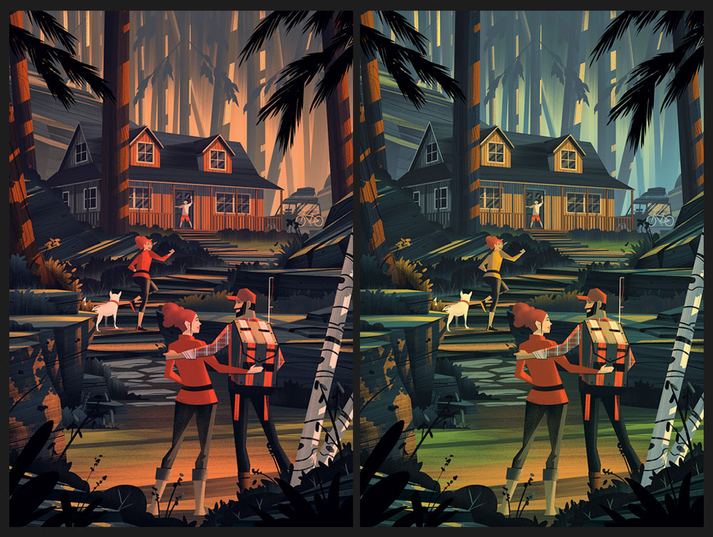
I tried a few different options to hit the right 'sunset' look which was a requirement stipulated in the brief. Any brief that asks for a sunset is fine by me! Here are some of my explorations:
I tried a few different options to hit the right 'sunset' look which was a requirement stipulated in the brief. Any brief that asks for a sunset is fine by me! Here are some of my explorations:
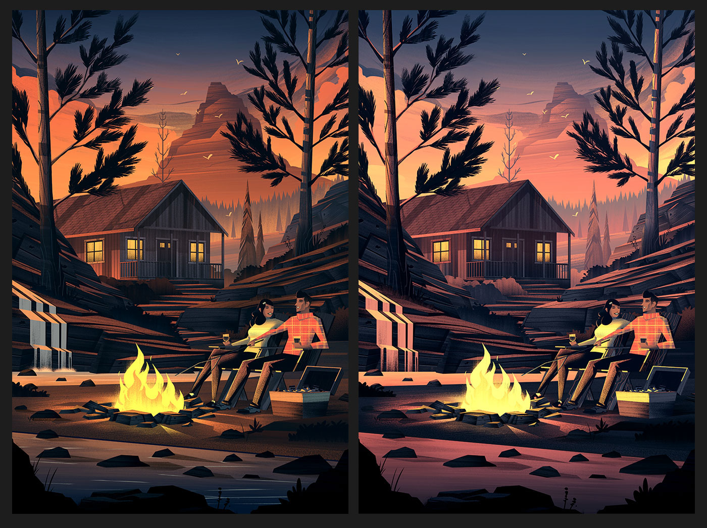
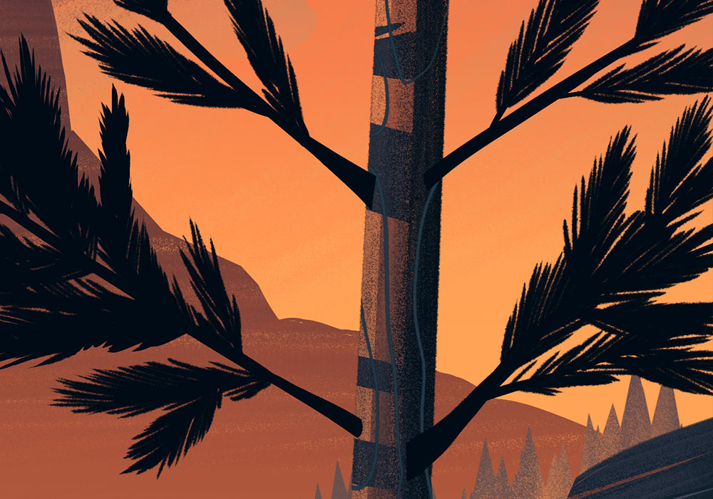
Final
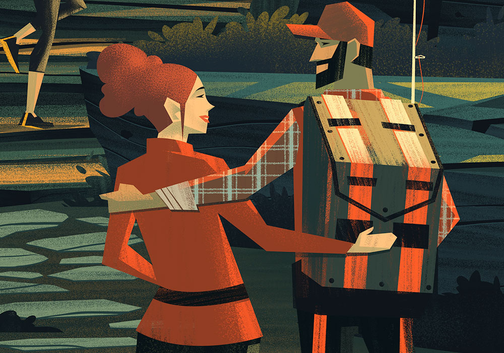
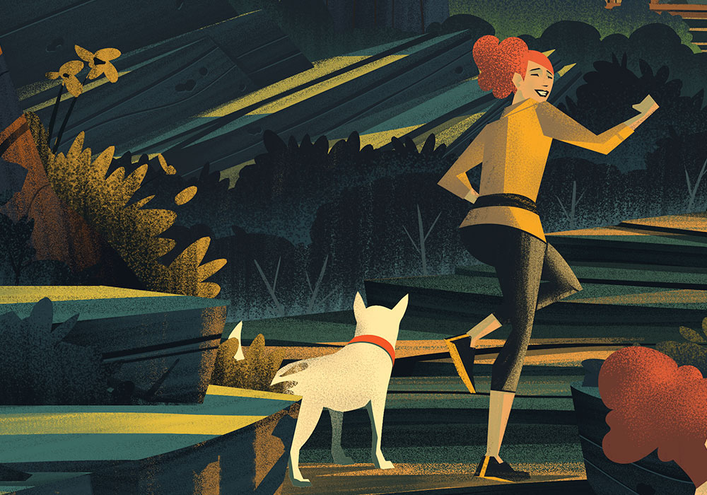
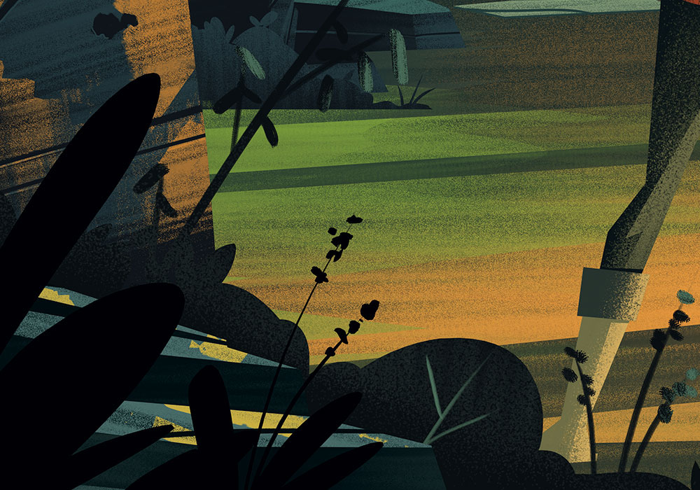
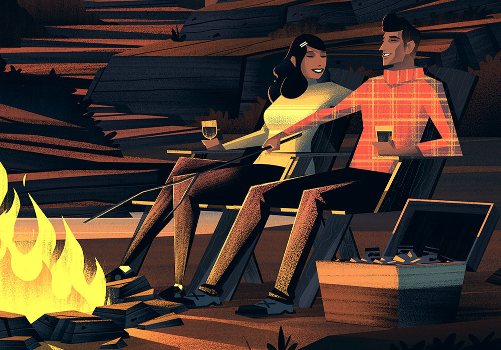
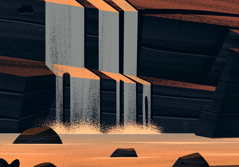
Once the color options were reviewed, this is the final we landed on. I've included a handful of detail shots so you can get an up close view of some of the more subtle elements you'd see if you were looking at a printed version.
Once the color options were reviewed, this is the final we landed on. I've included a handful of detail shots so you can get an up close view of some of the more subtle elements you'd see if you were looking at a printed version.


Closing Thoughts
Big thanks to my agents Deborah Wolfe and Lisa Pomerantz for their tireless efforts in helping with this project and to Tony Thielen for all his help. Drawing cabins, outdoors, & families, with great agents who support me and a great client... I truly can't ask for more. Its a dream come true being able to work on these kinds of projects and I hope you enjoy the results as much as I enjoyed creating them.