
The Umbrella Factory
2015
As a lover of animation, new and old, American and foreign, it has always been a dream and goal of mine to one day work in the industry in some capacity. In 2015, I was blessed to have that dream turn into a reality with one of the most fun projects I've worked on in my career: backgrounds for Naissance TV's, "The Umbrella Factory".
I had the distinct honor of working with Nick Trivundza from Naissance, and after one call discussing the project, I was thrilled to start. I was even more excited when Nick sent over the story and brief for the backgrounds I would be illustrating. Like with all my clients, I was determined to make this project the best work I was capable of, and the subject matter and story made it ripe with opportunity to do so!
The interesting challenge with these backgrounds is they needed to be fully layered for animation purposes. This meant I not only had to create a compelling scene (design, layout, lighting, etc.) but I had to draw much of what you don't see when viewing the static image. It took a lot of effort, but I'm thrilled with the results and looking forward to seeing what Nick's amazing team creates with the assets.
Now let's dive into the creation process!
The Dark Forest

Sketches
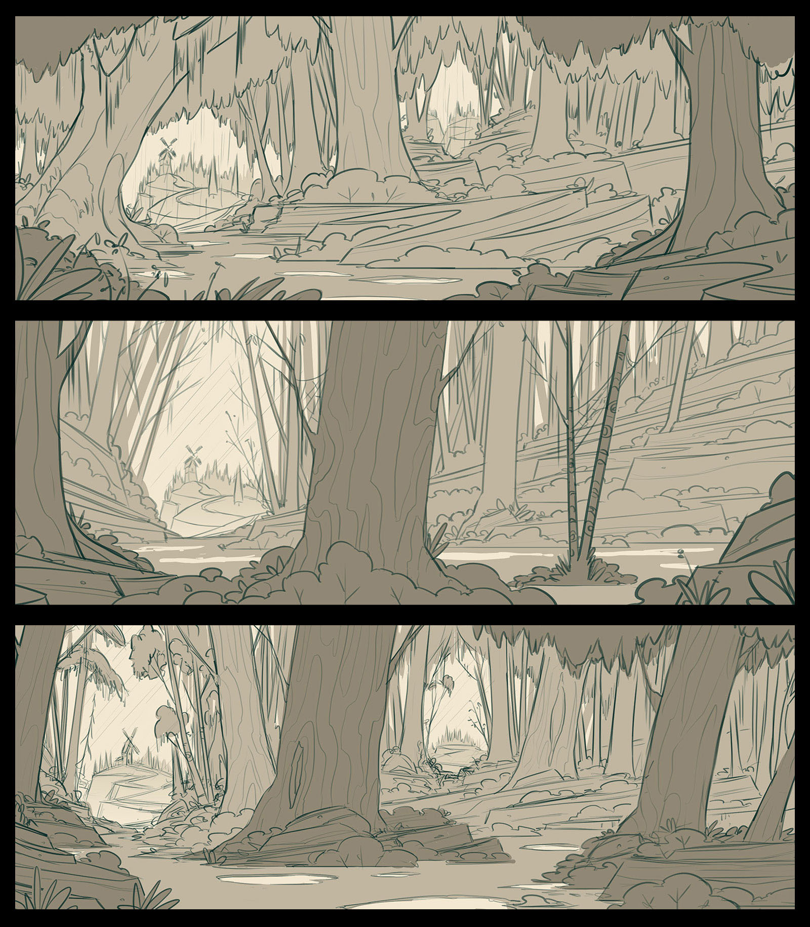
The first piece I worked on to help establish the overall mood and tone of the world was The Dark Forest. Nick's brief had a few special elements which needed placement in the overall composition, but for the most part, it was straightforward sketches which helped me find the design. I followed my typical design process and did small thumbnail sketches on paper to focus solely on my ideas and the layout. Once I had a good handle on the thumbnails, I moved to Photoshop where I created the following sketches to show Nick:
The first piece I worked on to help establish the overall mood and tone of the world was The Dark Forest. Nick's brief had a few special elements which needed placement in the overall composition, but for the most part, it was straightforward sketches which helped me find the design. I followed my typical design process and did small thumbnail sketches on paper to focus solely on my ideas and the layout. Once I had a good handle on the thumbnails, I moved to Photoshop where I created the following sketches to show Nick:
Flats
Once the sketch was chosen, I moved to full scale production mode and laid down black and white values and textures. The two questions I get most often on this step of my process are 1. How do you get your textures and 2. How do you transition from black and white to color?
Once the sketch was chosen, I moved to full scale production mode and laid down black and white values and textures. The two questions I get most often on this step of my process are 1. How do you get your textures and 2. How do you transition from black and white to color?
I always feel bad giving out answers to these questions because the answers seem to kill a little hope that there's some secret option I've discovered that will help everyone out... the reality is I simply use the method I'm comfortable with though I'm certain there are a number of roads to the same result.
To get my textures, I use custom pressure sensitive brushes in Photoshop with the aid of my trusty Wacom Cintiq. I don't like stamp textures, overlays, or noise filters in PS because they don't give me the control I want to really leverage the textures to define form and lighting. You can find loads of brushes like the ones I've been customizing (I'd suggest Kyle T. Webster's brushes for starters).
To transition from black and white to color I am literally just going in and replacing each black and white value with a color of my choice.

Color
Now that the flats are in place, I move onto color. One of the challenges in working on a set of illustrations like these is establishing the mood, tone, and color palette on this first piece. Once the color is set here, its much easier to apply to subsequent illustrations. Here are my initial explorations:
Now that the flats are in place, I move onto color. One of the challenges in working on a set of illustrations like these is establishing the mood, tone, and color palette on this first piece. Once the color is set here, its much easier to apply to subsequent illustrations. Here are my initial explorations:
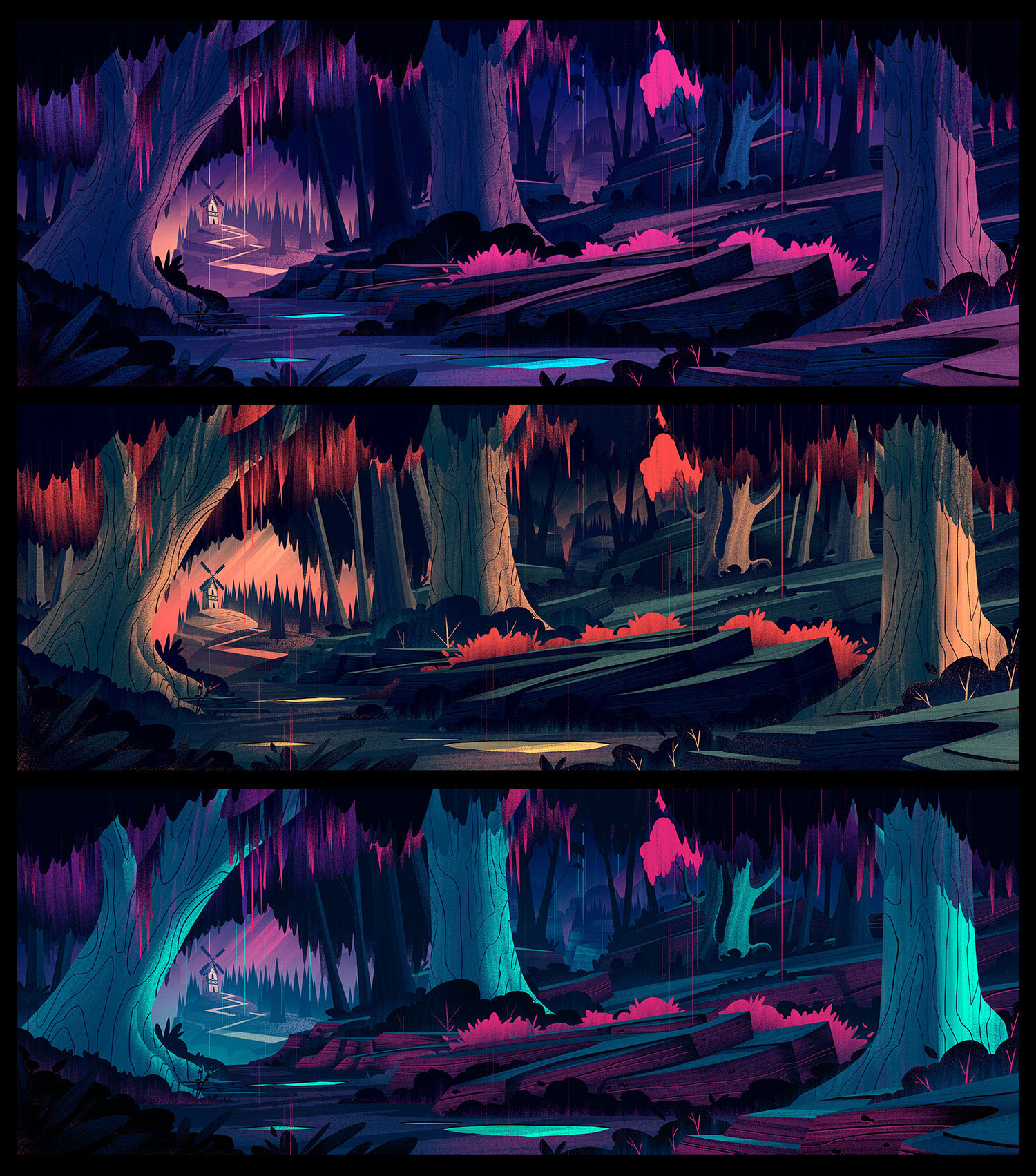
When given the choice, I always seem to favor the moody, almost neon colors. In this project, however, Nick needed a more subdued color palette which would have spots of color placed in areas of interest. The palette also needed to be more subdued which really helps to enhance the spooky feel of the world. Here are a few of the details within the piece:


I also mentioned above that these pieces needed to be fully layered. I put together a quick gif to show some of the layering I did on the piece (though there are actually a lot more layers than you see even in this gif):

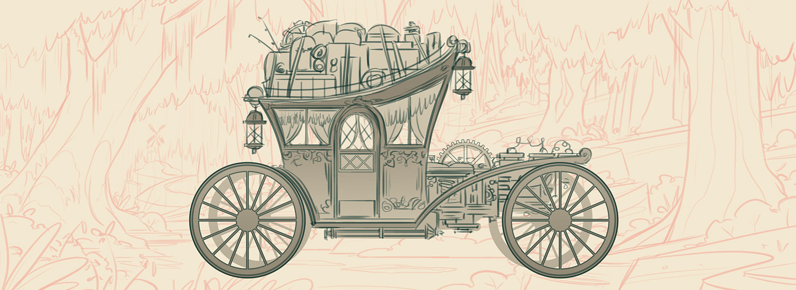
The Dark Carriage
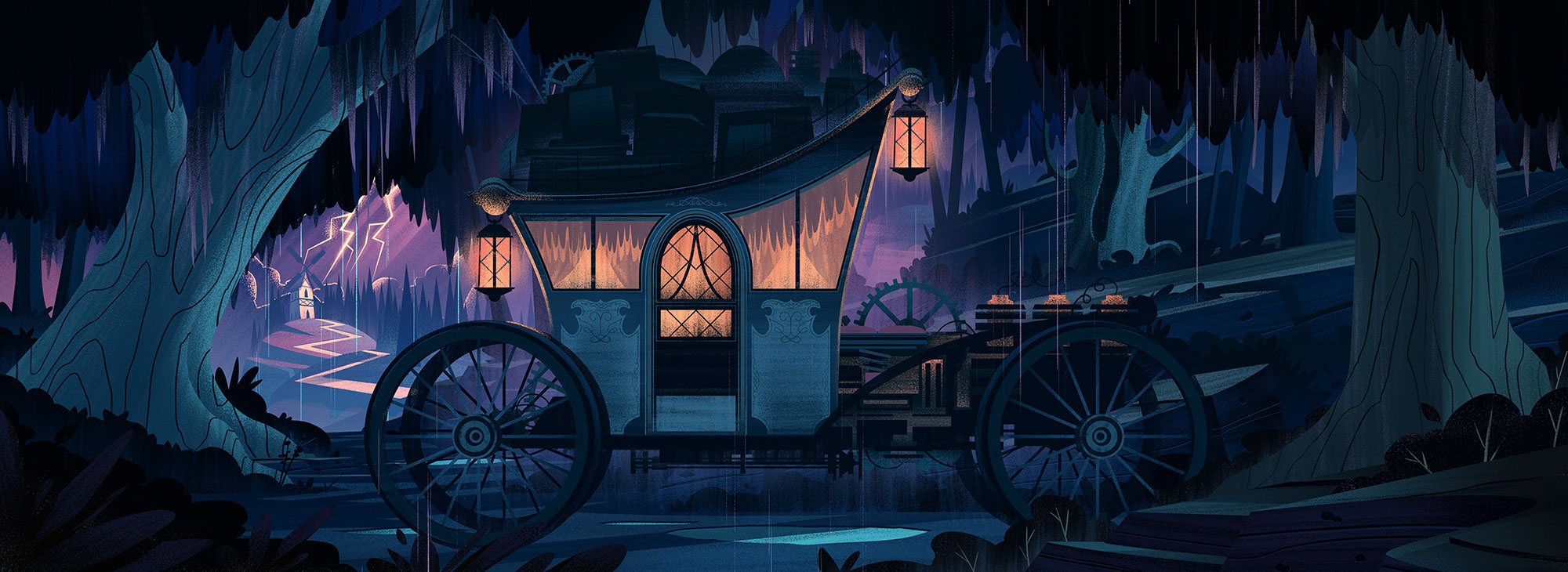
In addition to the Dark Forest, I had the opportunity to design a Dark Carriage which would serve as the transition and transportation for the story. Once again I took to Photoshop to do my initial sketches and when the design was approved, I worked in Adobe Illustrator to get my rough shapes in place. I enjoy working in Illustrator for mechanical illustrations because the vector tools are much easier to use.

The Curiosity Shop

Sketches
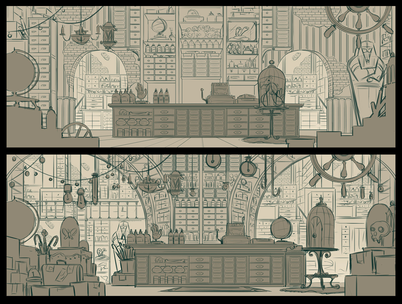
The second scene I worked on was the one that turned out to be my favorite - The Curiosity Shop. My biggest challenge with this piece was choosing a direction - I had lots of ideas and sketches I'd worked out on paper but in the end, I opted to present these two (which I worked out digitally in PS):
The second scene I worked on was the one that turned out to be my favorite - The Curiosity Shop. My biggest challenge with this piece was choosing a direction - I had lots of ideas and sketches I'd worked out on paper but in the end, I opted to present these two (which I worked out digitally in PS):
Flats
I really loved the overall composition of this piece and was excited to get into the flatting portion of my process. I had a few ideas on lighting which I was able to work out here. The thing I love about this method is, if the piece works in black and white, it stands a very good chance of working in color:
I really loved the overall composition of this piece and was excited to get into the flatting portion of my process. I had a few ideas on lighting which I was able to work out here. The thing I love about this method is, if the piece works in black and white, it stands a very good chance of working in color:
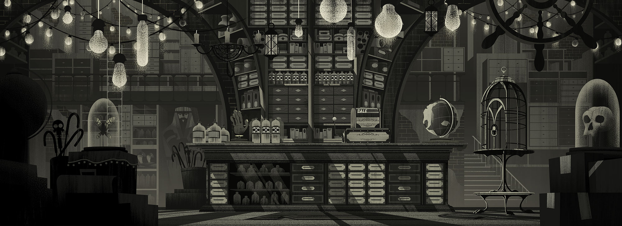
With the flats working, the lighting and textures established, and the crazy amount of detail (both seen and unseen) in place, it was time for color. Here are a few of the up close details:


The Umbrella Factory
Sketch
I knew the Umbrella Factory was going to be a fun one to work on and immediately started picturing huge machines built into old brick structures, sparking and whirring to produce, of all things, umbrellas! Here is the sketch I came up with:
I knew the Umbrella Factory was going to be a fun one to work on and immediately started picturing huge machines built into old brick structures, sparking and whirring to produce, of all things, umbrellas! Here is the sketch I came up with:
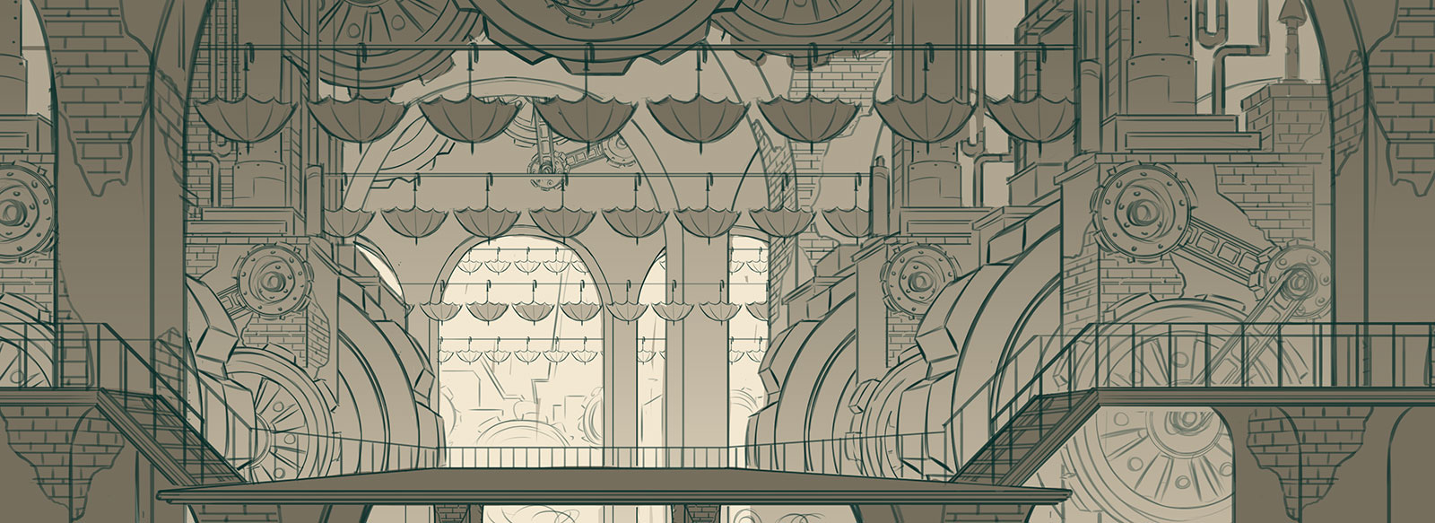
Flats
So much texture and detail - this was a big challenge to paint, but it was well worth the effort.
So much texture and detail - this was a big challenge to paint, but it was well worth the effort.
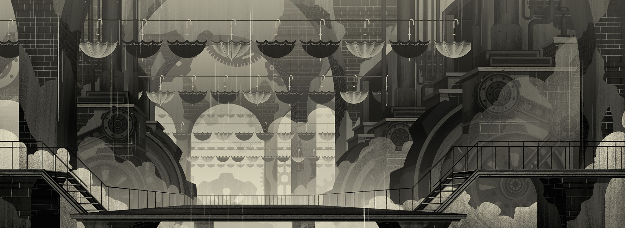
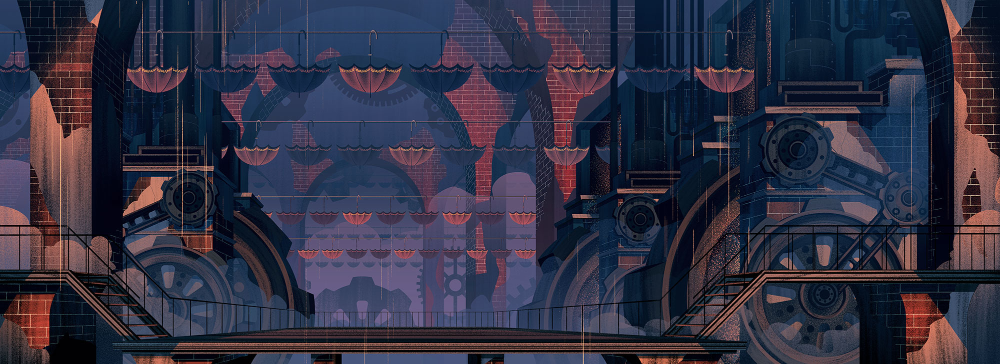
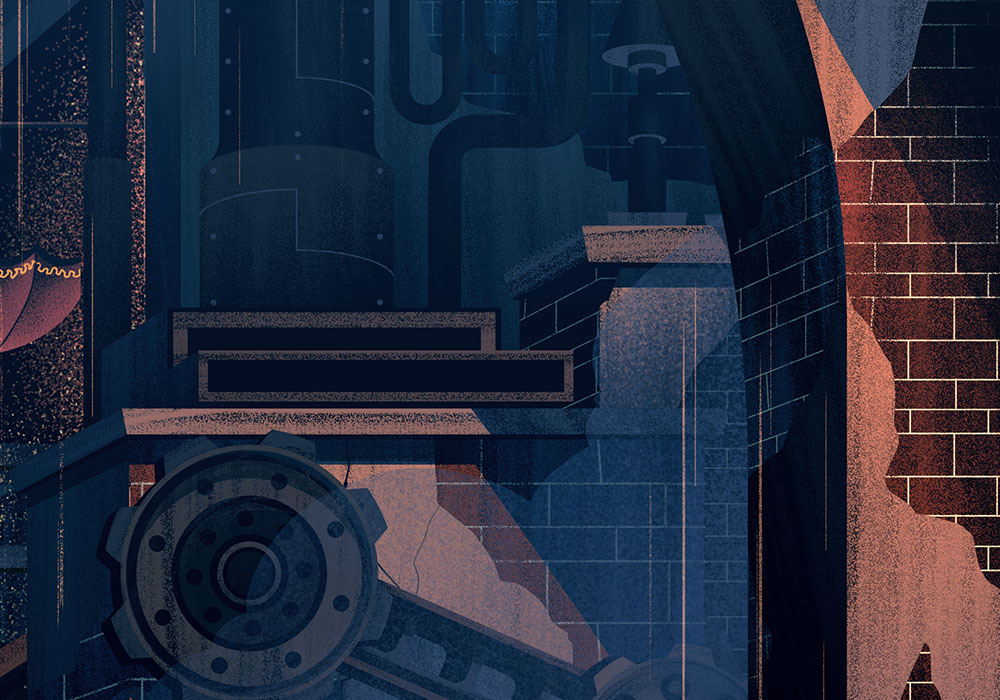
Color
I really enjoyed coloring the factory because - well who doesn't love painting old brick and lots of bizarre gears? This piece became a labor of love and I really felt like I was building a world brick by brick. Here are some of the details:
I really enjoyed coloring the factory because - well who doesn't love painting old brick and lots of bizarre gears? This piece became a labor of love and I really felt like I was building a world brick by brick. Here are some of the details:


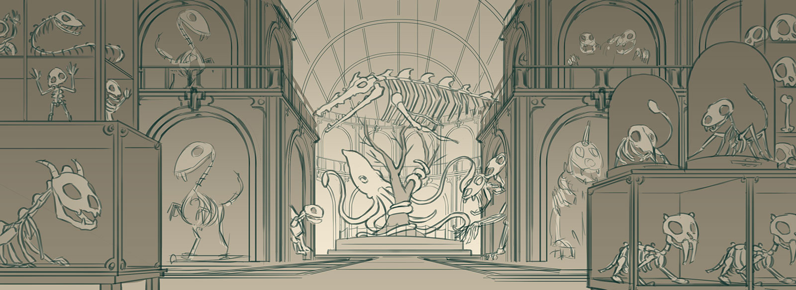
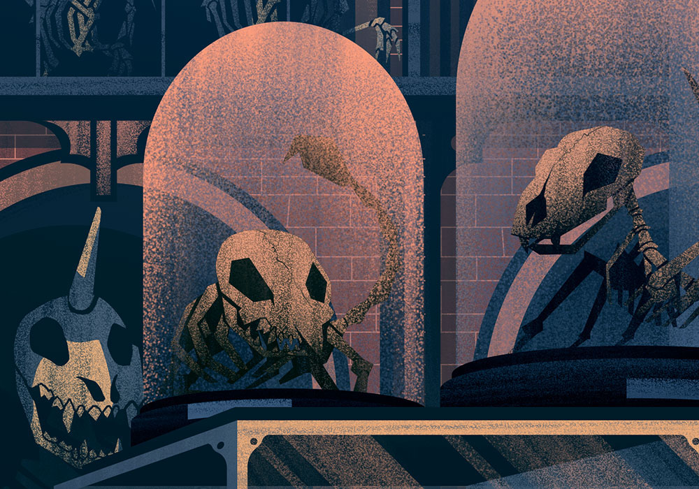
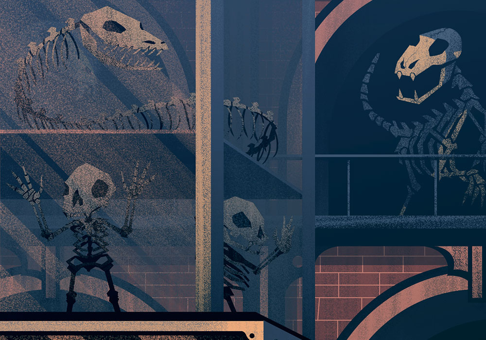
The Mysterious Museum

Sketches
The Mysterious Museum was a fun challenge, especially as it entailed rendering out lots of bones and fun details. The sketch for this one came together fairly quickly as I had a good idea of what the overall piece would look like right when I read the description (which doesn't always happen, but I'm thankful when it does!):
The Mysterious Museum was a fun challenge, especially as it entailed rendering out lots of bones and fun details. The sketch for this one came together fairly quickly as I had a good idea of what the overall piece would look like right when I read the description (which doesn't always happen, but I'm thankful when it does!):
Flats
For me, the lighting always comes together most prominently during the flatting phase. There are still lots of adjustments I make in color (which is why my color image, when desaturated, doesn't match my black and white version perfectly), but so long as I enjoy the process, I'll usually enjoy the results.
For me, the lighting always comes together most prominently during the flatting phase. There are still lots of adjustments I make in color (which is why my color image, when desaturated, doesn't match my black and white version perfectly), but so long as I enjoy the process, I'll usually enjoy the results.
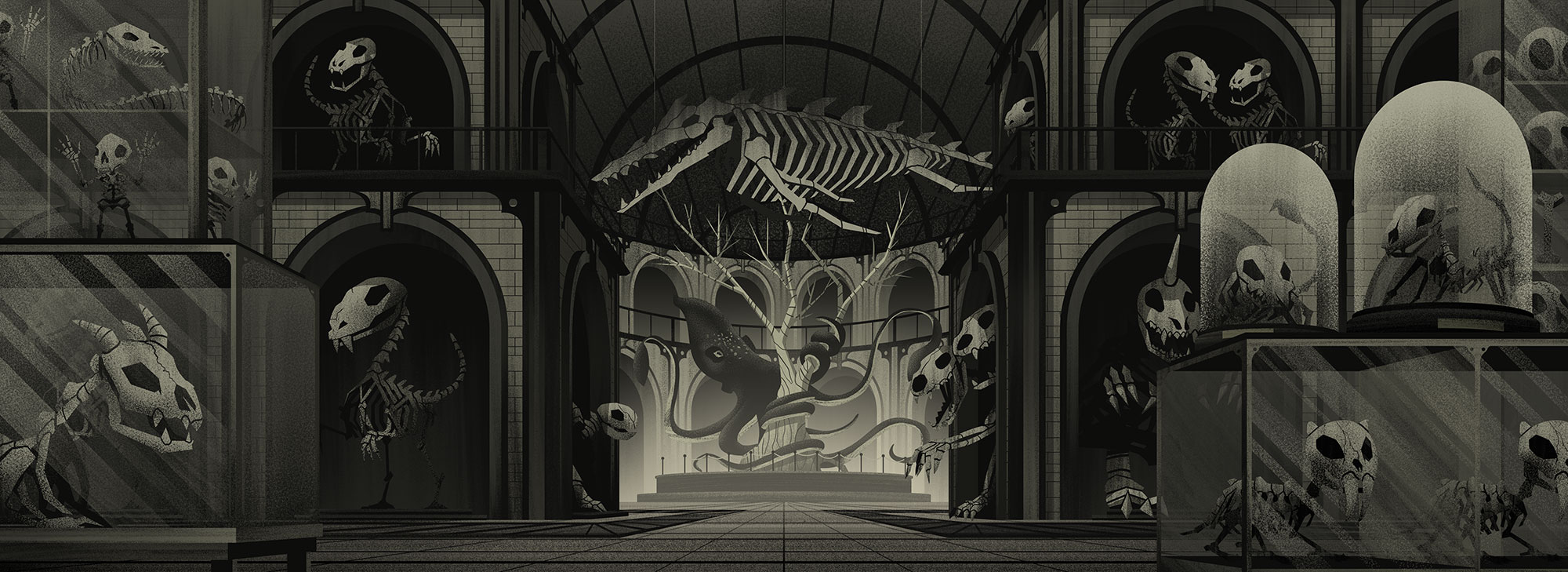
Color
And of course, the details:
And of course, the details:

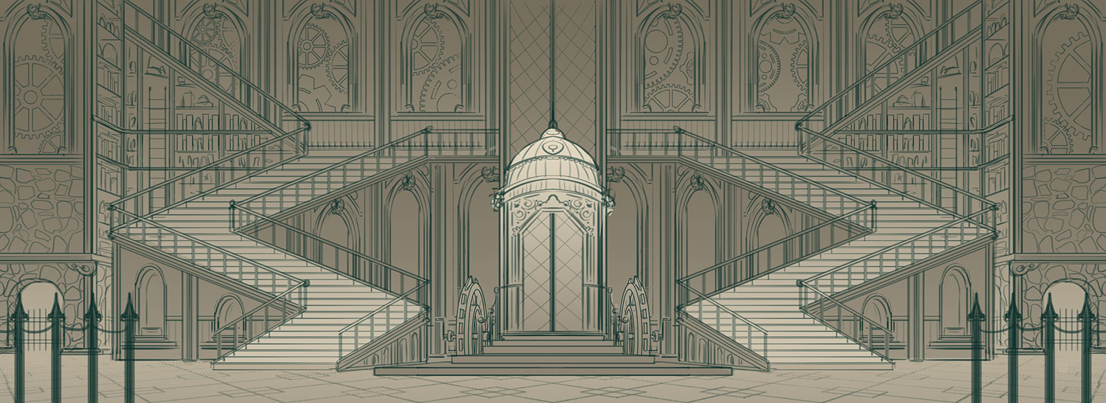
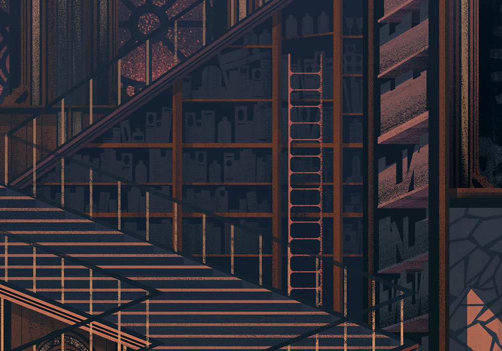
The Manor Interior

Sketches
This is easily one of the most complex interiors I've done and I really enjoyed the process and end result. It was a fun challenge trying to incorporate stone, wood, and metal into the environment. For this piece, I did the majority of my brainstorming digitally in PS.
This is easily one of the most complex interiors I've done and I really enjoyed the process and end result. It was a fun challenge trying to incorporate stone, wood, and metal into the environment. For this piece, I did the majority of my brainstorming digitally in PS.
Flats
I felt like this one really came together during the flats phase. Its always an interesting challenge trying to lock down the right shapes and figure out how I want to stylize everything.
I felt like this one really came together during the flats phase. Its always an interesting challenge trying to lock down the right shapes and figure out how I want to stylize everything.

Color
Now that I had a handful of pieces colored, the palette for the world was set and I could more easily identify the right set of colors for the interior of the Manor. Here are the details:
Now that I had a handful of pieces colored, the palette for the world was set and I could more easily identify the right set of colors for the interior of the Manor. Here are the details:


The Graveyard Manor

Sketches
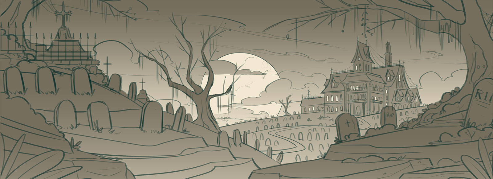
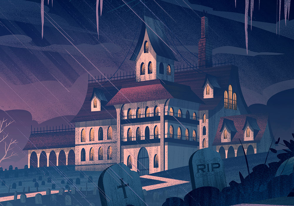
The last piece in this series was the Graveyard Manor. It was a really fun one to end with and I enjoyed painting up a moody atmosphere. This is where the sketch went - which I worked out digitally on my Wacom Cintiq Companion 2.
The last piece in this series was the Graveyard Manor. It was a really fun one to end with and I enjoyed painting up a moody atmosphere. This is where the sketch went - which I worked out digitally on my Wacom Cintiq Companion 2.
Flats
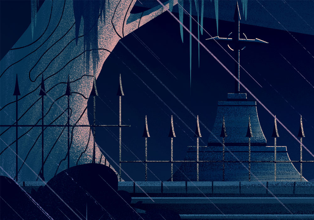
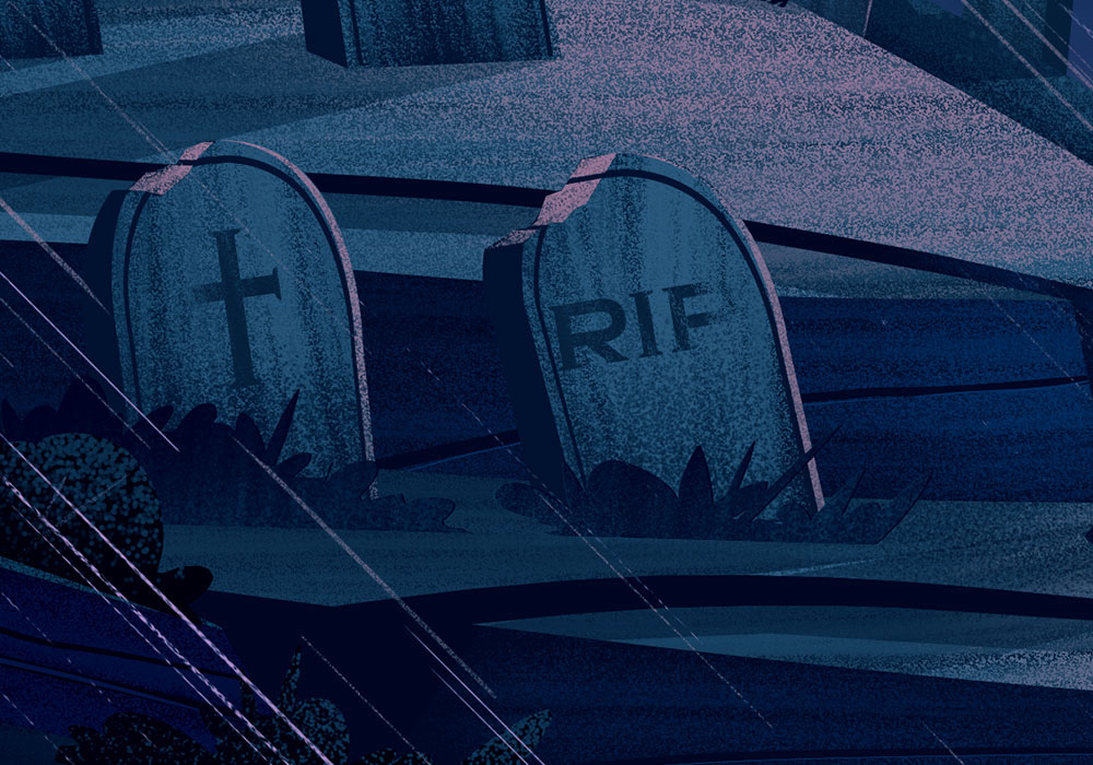
Here are the flats for this one, followed by the details:
Here are the flats for this one, followed by the details:


Final Thoughts
Did you make it all the way down here? Yowsa, thanks a bunch!
I'd also like to thank Nick from Naissance for what is easily one of my favorite projects this year. I always love being able to serve others with my illustrations, especially when we're able to collaborate and create something better together than we would apart.
I also want to thank my agents, Deborah Wolfe, and Lisa Pomerantz because they are constantly helping me to balance my schedule to ensure things go smoothly, encourage me when I loose it (I mean I paint bricks for a living and love it - I'm bound to go crazy once in a while), and are always seeking to serve clients well. Can't go wrong with a team like that!