The Incredible Space Raiders From Space
2014

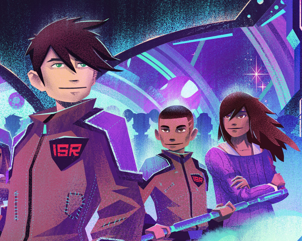
This year, I was blessed to work on my first book cover for Simon & Schuster for a Young Adult novel titled, "The Incredible Space Raiders From Space!", written by Wesley King, art directed by Laurent Linn.
I can't say enough good things about my experience working on this project! I really enjoyed reading Wesley King's writing and was thrilled to visualize the world he built. Working with Laurent Linn was a great opportunity and he made the process such a smooth one by giving me lots of resources, prompt replies, latitude to explore, and an excitement level that made an already great project a true joy. And hey - who doesn't want to be drawing spaceships and fun characters!?
Ok, enough gushing (I can go on and on!) - lets get to some process!
First up, we have the rough sketches. I wanted to keep my sketches more rough for this project as I pushed to explore a few different approaches. The first sketch I did (which ended up being the strongest) was built around the main character. Everything around him was secondary and really helped bring him to the forefront. The second sketch I did was a similar approach using montage (moar montage!!) to bring in more expression with the characters. The next 2 sketches focused on creating a narrative, both based on scenes within the book which saw our characters in perilous situations. While each one had appeal, the first sketch ended up being the winner.

With the initial direction set, I pushed forward into the details of the piece. I wanted to render tighter pencils at this phase to make sure I had all the character details correct before proceeding into the finals. The best part about this is it gives me more confidence to focus on color and lighting because all the guesswork has been eliminated. I've also included the trim line (in red) on this image. Giving this much trim allows the designers enough wiggle room to adjust things if needed.

With the sketch approved, I moved into one of my favorite stages: blocking in values and lighting. For everyone asking how I'm achieving my textures, I use custom pressure sensitive brushes in Photoshop with my Wacom Cintiq. You can find tons of brushes that are similar, and each one works great for different looks and feels.
When I'm working on an illustration, I tend to follow some advice I learned as a graphic designer: if it works in black and white, you have a better chance of making it work in color. When transitioning to color, if I made sure to keep the value ranges I established here in the black and white version, there was a good chance the color option would turn out well.

I developed 3 color options for the cover. I honestly didn't have a favorite as each color option drew out different aspects of the illustration. I was happy I wasn't the one who had to decide, and glad everyone who had eyes on the project was happy with the results.


I also provided a side by side comparison of each of the covers. I hoped this was helpful in trying to determine which one worked best for their intents and purposes.

Once the cover illustration was completed, Laurent Linn went to work on the text layout & design, and suddenly it looked like a book cover! Check out the final below:

Big thanks to Laurent and his team at Simon & Schuster for such a great project. I can't tell you how refreshing it is to work with such a great team who is genuinely as excited about these kinds of projects as I am. As an illustrator, you really can't ask for a better client and project.
And a really big thanks to Wesley King for the great read and creation of such a fun world! I have a feeling we grew up with a lot of the same influences because drawing his world felt like a coming home.
And last, but certainly not least, thanks to my wonderful agent, Deborah Wolfe, for lining things up on the business side of things while ensuring as smooth a process as possible. You really can't beat a good agent, and Deborah is one of the best!
Thanks everyone! Enjoy the details!