
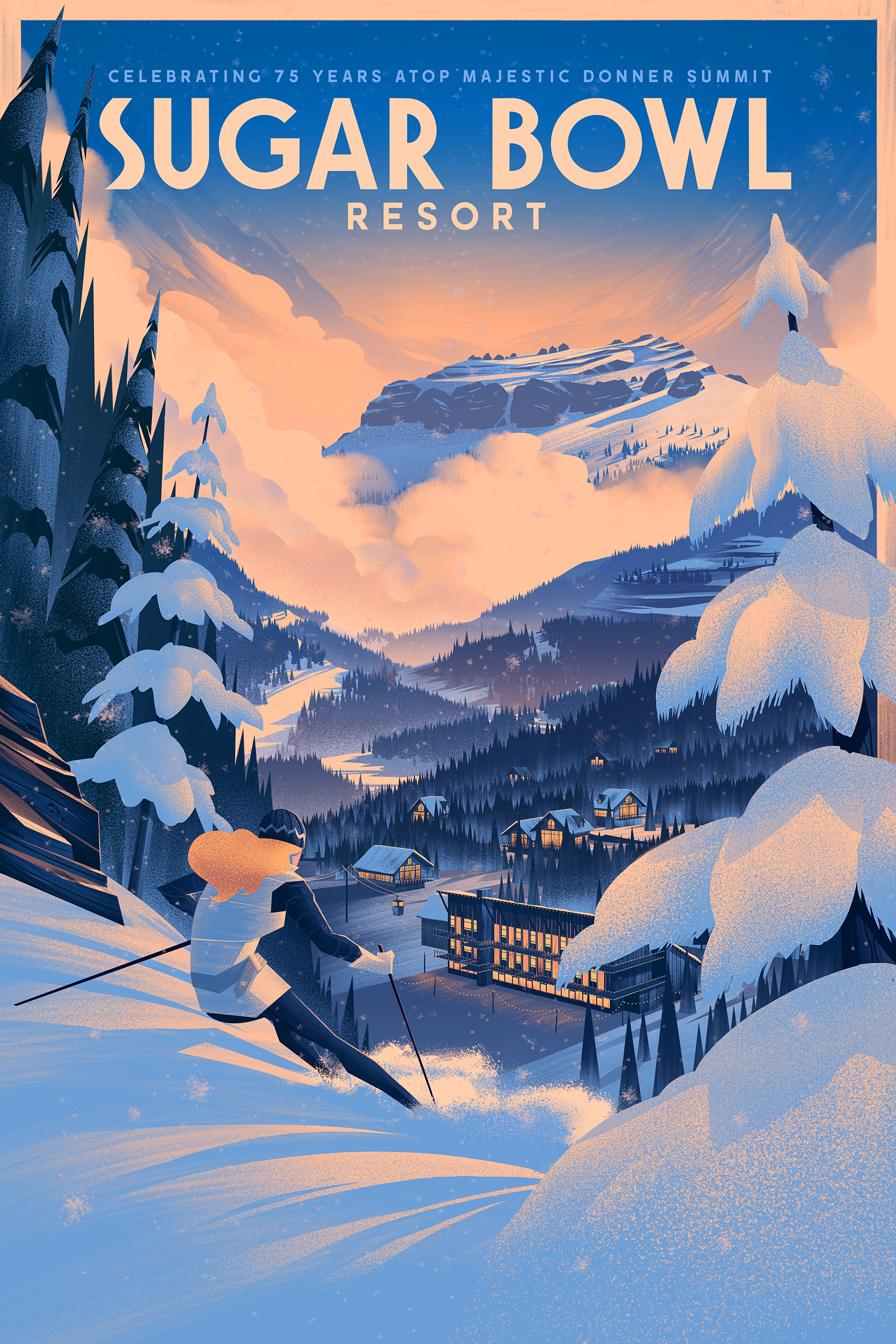
Sugar Bowl Resort 75th Anniversary Poster
2014
“Beyond was all around me. My dream was a dream no longer. I suppose I was here because this was something I had to do. Not just dream about it, but do it. I suppose too I was here to test myself. Not that I had never done it before but this time it was to be a more thorough and lasting examination.”
— Richard Proenneke
This quote from Richard Proenneke (Alone in the Wilderness) perfectly encapsulates my experience working on the 75th anniversary commemorative poster for Sugar Bowl Resort. When I received the brief from Tyler at Saint Pierre, I knew this would be the project I could really test myself on. Every lesson I've learned studying the craft of illustration was poured into this piece and I enjoyed every moment of it.
Before I get into the process for this one, I wanted to take a moment to say thanks to Tyler at Saint Pierre as well as the fine folks at Sugar Bowl Resort for such a great opportunity and to my agent, Deborah Wolfe for helping me on one of the most memorable projects I've worked on so far. All of them were instrumental in bringing this piece to life and I am thankful for their contributions.
I realized shortly after receiving the brief that I've known about Sugar Bowl resort since I was a kid! There's a fascinating history behind Sugar Bowl and Walt Disney which resulted in many of their trails being named after Disney characters as well as an animated short starring Goofy learning to ski at Sugar Bowl. When I saw photos of the main Lodge, I realized the animated short took place at Sugar Bowl. It was a lot of fun knowing my past was connected to this amazing resort through one of my biggest artistic influences.
With a dream project at hand and motivation to contribute to an artistic legacy, I was chomping at the bit to get started!
Process
As per my usual process, I started with lots of sketches and explorations in my sketchbook using my trusty col-erase pencils. Once I'd worked out a handful of compositions, I jumped onto my cintiq in Photoshop and produced these sketches:
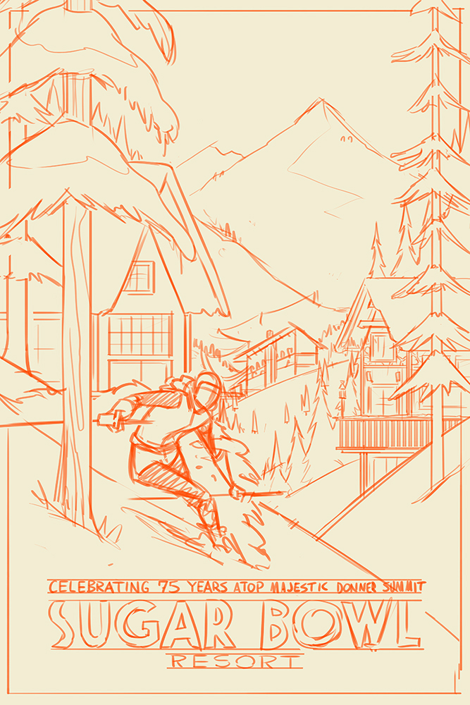
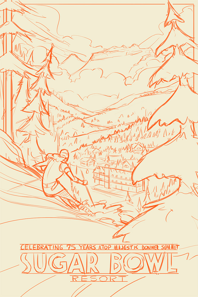

The challenge with this piece was trying to show multiple aspects of Sugar Bowl which make it such a wonderful ski resort: great slopes, scenic views, and a snowbound village you actually take a gondola into (amazing!). I also had in mind early on the kind of lighting I wanted to use which would simultaneously capture bright slopes for skiing as well as lights within the snowbound village. That brings us to the next step...
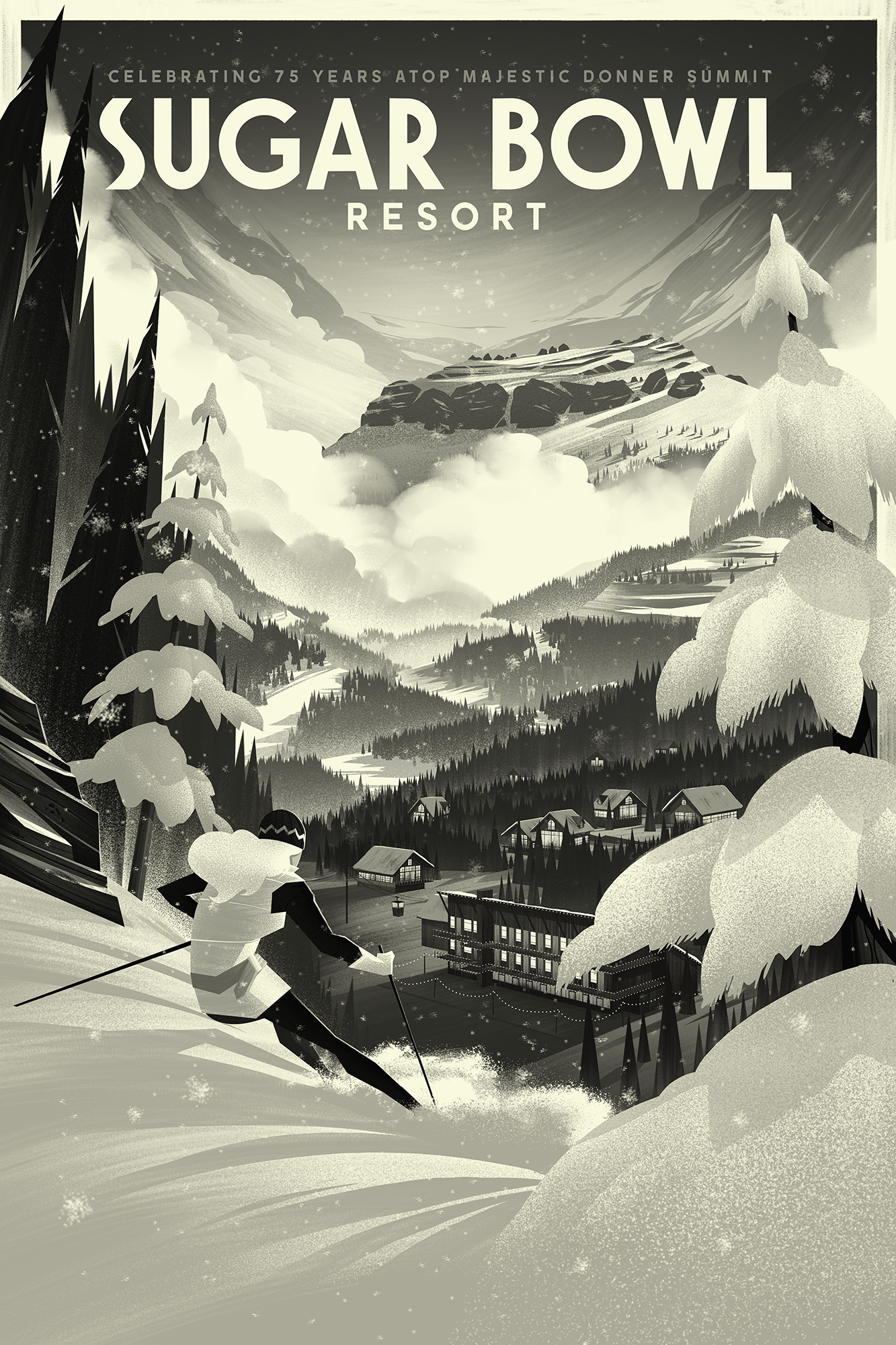
Value Blocking & Brushwork
With the sketch approved, I moved into laying out the values and brushwork. To do this, I use custom pressure sensitive brushes in Photoshop as well as my cintiq. I work in Black and White to keep things simple, especially on a piece as complex as this one, so I can focus on getting the lighting and placement of whites, blacks, and values in between. If I can make a piece work in black and white, it increases the likelihood of working in color.
In Color
I really loved the way the black and white version of this piece came out. I could see, however, that coloring this piece was going to be a challenge simply because there were lots of layers and lots of complexity in the way I wanted certain aspects of the illustration to stand out. I ended up producing a handful of color options and gave the client the challenging task of picking an option (cause I never can!).
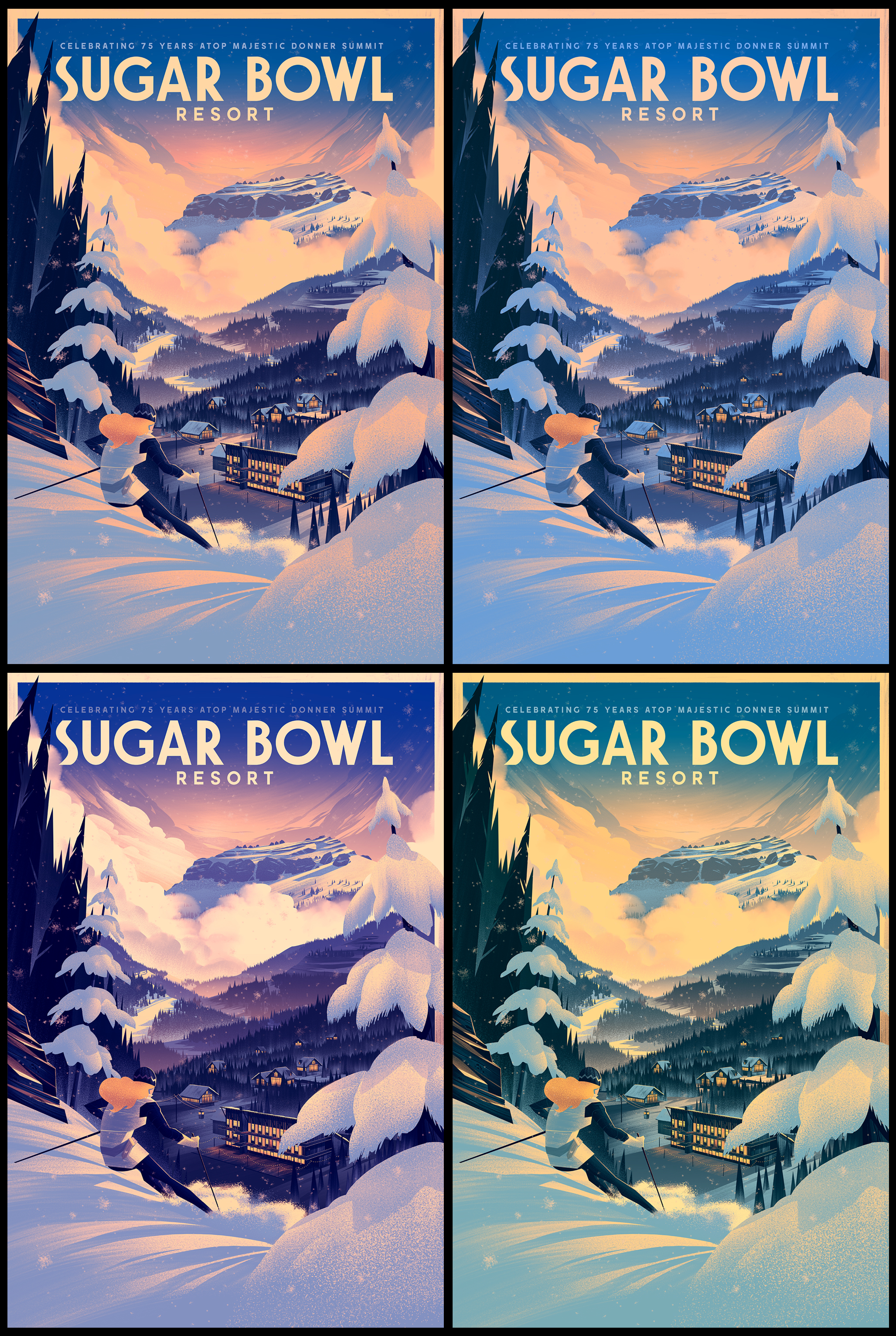
While a number of my color options looked dramatic, a few of them skewed too far on the dark side, especially around the snowbound village. Tyler had the great suggestion of lightening up the town just enough so it would look more inviting without loosing the drama of seeing the town lights. The rest was history!
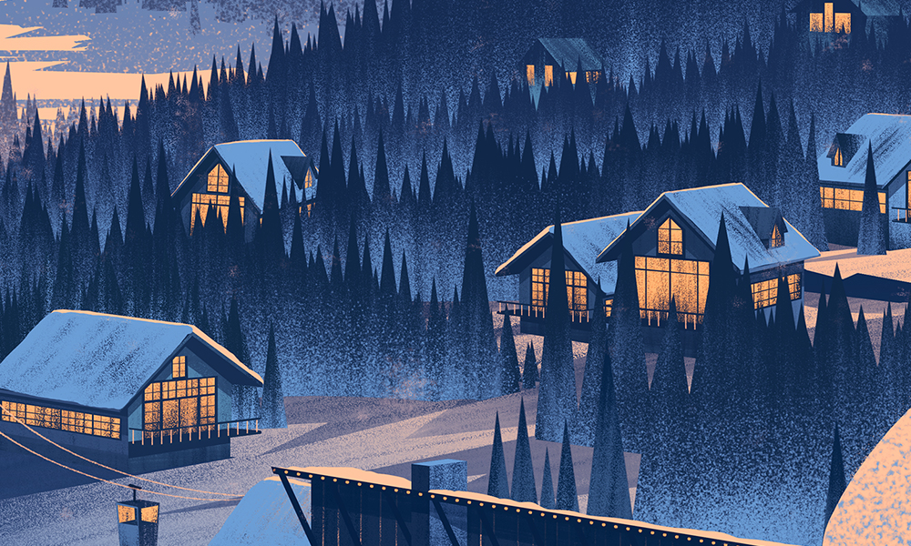
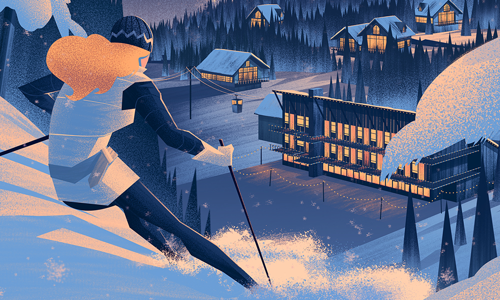
Here are a few detail shots which you'd be able to see in the print:


Thanks so much for taking the time to read my ramblings and view what I'm doing! I appreciate it and hope you enjoy it as much as I enjoy making these pieces.