REI January Clearance
2017
Happy 2017 everyone!
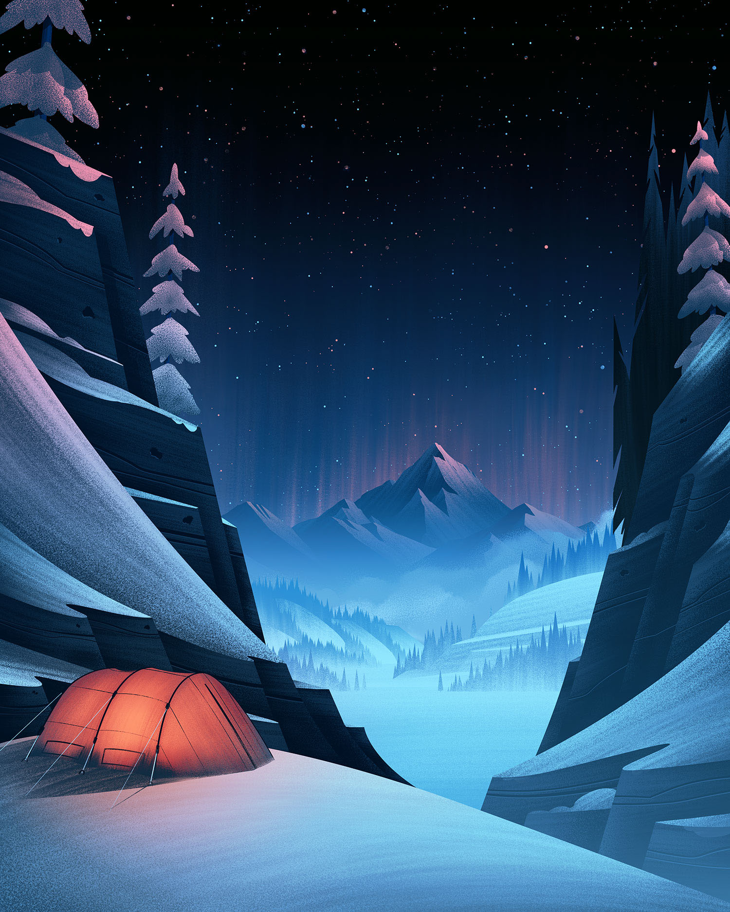
To kick things off I thought I'd post a quick look at the process for an illustration I did for an ongoing series with one of my favorite clients, REI. This piece was created for their January Clearance sale which meant they wanted to feature a snowy mountain landscape with a tent somewhere in the scene. Working with REI's design director, Bill Wardlow, we wanted to arrange the composition in such a way that text could be framed by elements within the illustration. With the direction in hand and plenty of snowy reference surrounding me in my home state of Colorado, it was time to sketch.
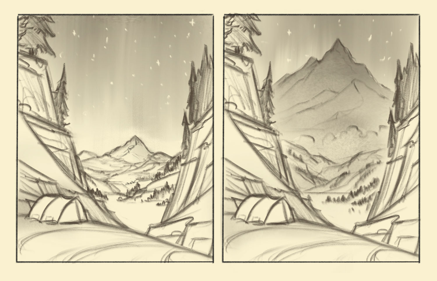
Sketches
For sketching, I have been using an iPad Pro + Apple Pencil as well as the Procreate app. One of the things I love about this setup for sketches is it allows me to quickly generate different ideas and then pursue and refine the best ideas I can come up with. For this particular piece, I knew I wanted to frame the center of the composition with snowy cliffs on the sides and bottom of the illustration. I was also very excited to try abstracting the snowy cliff edges to be swooping shapes which would lead your eye around the piece. Whenever I can find places to simplify lines or create with bold shapes, I take it because those explorations can lead to fun results.
After a few brainstorming sessions, I decided these two sketches were worth showing. Typically I only show 1 sketch but on this piece, I wanted to get clarity on how the illustration would best serve REI's needs in terms of creating open space for text placement. I presented an option with an open sky as well as an option with a more dramatic mountain closeup to the camera which could potentially be pushed into the background using colors which blended more with the sky. In this instance, the option with the open sky worked best for their needs.
Black & White
With the sketch established, it was time to move onto painting. I use Photoshop and a Wacom Cintiq for my painting as they are the tools I'm most comfortable with to get the results I'm after. When I'm working in the black & white stage, I am searching for the most pleasing finished line on all my shapes.
Even with a well defined sketch, there are still decisions to be made in terms of how I create my shapes, which lines I'll follow, and lighting choices which will dramatically impact the piece. I'm never just 'tracing' my sketch with shapes, just like a comic book inker doesn't simply trace the pencil lines they're using as a guide.
When I'm thinking about the lighting of a piece, I am thinking of lighting scenarios which will show the form of each object, capture a powerful mood, and create a compelling composition to move push and pull objects within the illustration. Its a lot to focus on, which is why I typically tackle this step in black and white and not color (though that's not a rule I follow all the time).

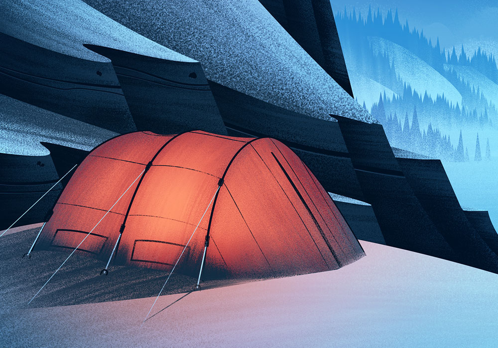
Color
Coloring a piece like this is a really fun challenge. Its a night scene, but as anyone who has lived in a winter location knows, the snow can make for a very bright environment even in the dark. I wanted to capture that frozen winter landscape feel with colors which created a stark contrast to the warm glow of the tent.
I'm excited to see what 2017 holds in the way of illustration challenges and I'm thankful for ongoing working relationships with clients like REI, my agent, Deborah Wolfe, and everyone else who made this piece possible. Those relationships allow me to do what I do and create opportunities I never would have dreamt of.
I'm also profoundly thankful for the kind response of the online communities I'm part of. Its encouraging to know some of the work I do resonates with other creatives and a pleasure to share some of the journey for those who read these breakdowns.
Now let's go draw!