
Merkur Magazine Cover
2015
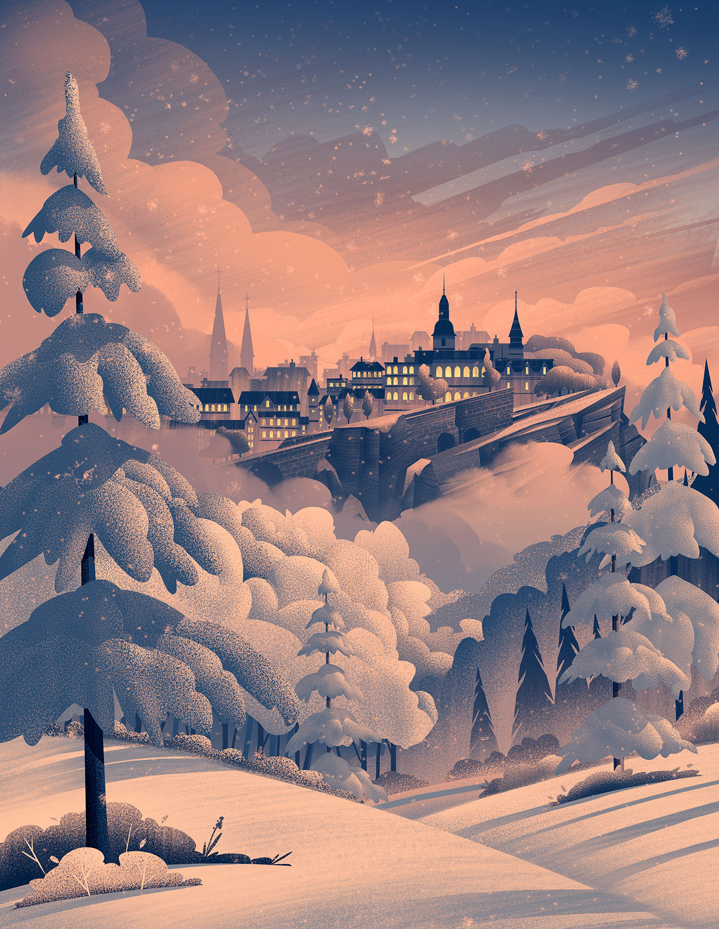
At the end of a very busy 2015, I had the honor and privilege of working on a really fun winter piece for Merkur Magazine, a magazine published byLuxembourg's Chamber of Commerce. The piece was used as the cover of Merkur Magazine, as well as a poster insert within the magazine's pages. It accompanied an article talking about the uncertain financial future of Luxembourg which needed to strike a precarious balance of hope and concern, while fitting in with the Christmas / Holiday / Winter season.
Once I received the brief from Patrick Ernzer, I spent a lot of time researching Luxembourg through loads of image searches, Google Earth, and written descriptions of its History. Part of what makes being an illustrator so fun for me is working with clients all over the world. It gives me an opportunity to learn about new cultures and locations and discover beauty all around. With the brief in hand and the mood and tone in my head, I set off with sketches.

I chose to illustrate a section of Luxembourg called Old Town Grund, which has an amazing array of structures resting on cliffs and old medieval fortifications. From a content perspective, I thought the landscape and architecture worked well to show the history of Luxembourg and the questions surrounding its financial sustainability without dropping into despair or an overly cheery mood. The sketch was approved with a few tweaks and it was off to color.
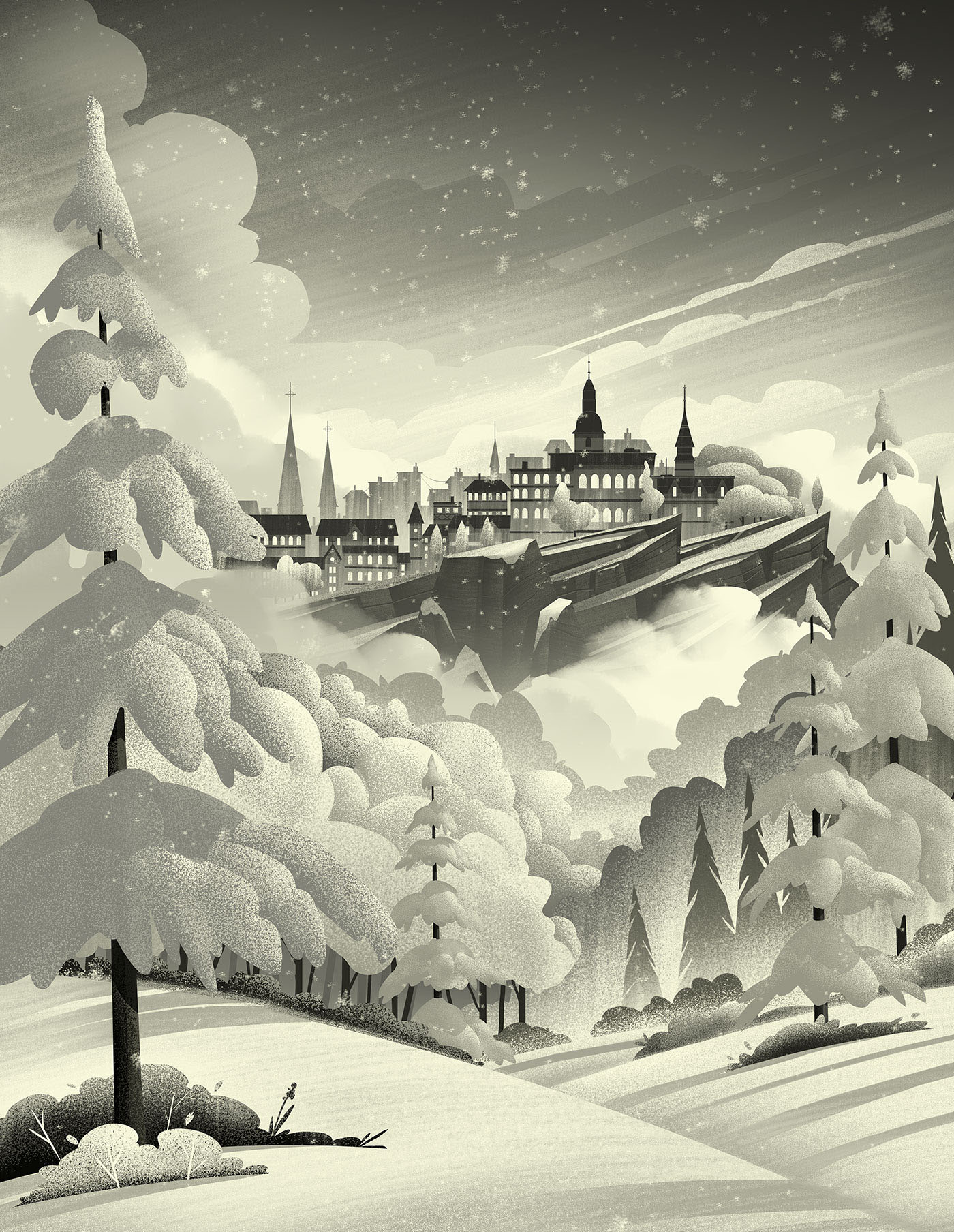
As per my typical process, I took to working in black and white values to establish the shapes, textures, and lighting. I really wanted to capture depth in the piece while showing a snow covered landscape. Snow can be a tricky thing to paint because it brightens everything up so much and often hides depth depending on the time of day. I always enjoy casting long shadows within my pieces to define form and composition, so I opted for a moody sunset lighting. With the flats and textures in place and the lighting defined, it was off to color.
While I do push a lot of my color values, I actually have a ton of reference photos I use to guide my efforts. Living in Colorado, I am never short on dramatic sunsets or sunrises. Every time I see one that stops me in my tracks, I snap a few shots and store them away for future reference. Its a great habit to get into because after a year, you'll have a full library of seasonal lighting which you can use for your work - and because you were actually there taking the photo, you can remember what that lighting felt like (which is very important when you're trying to convey mood in a piece).
Here are a few detail shots you'd see if you had the poster:


Big thanks to Patrick and his team for all their help and for the opportunity to work on such a fun project. We're slated to do a bunch more covers together next year and I can't wait to see what we're able to accomplish together!
I also want to say Thank You to my agents, Deborah Wolfe & Lisa Pomerantz for their tireless efforts and for being wonderful agents. 2015 turned out to be a really great year and I couldn't have done it without their help.
Lastly, big thanks to YOU for taking the time to follow along and reading my babble. I wish I had more time to be able to respond to everyone but please know that I truly appreciate all the comments, likes, retweets, etc. I never imagined an online community being a reward of this profession but being a part of it helps encourage me to continue growing and working hard to pursue this craft.
Beauty is all around and is desperately needed in what can be a very dark world. I hope True Beauty finds you in your day to day and I wish you a Merry Christmas & a Happy New Year.
-Brian