
Hawaii First Keyframe Illustration Series
2013
I had the good fortune of illustrating a collection of keyframes for an animated commercial for a Hawaiin property management company called Hawaii First, through ChopShop TV. You can imagine my excitement when they told me I'd be drawing pirate ships, Hawaiin islands, and sea creatures attacking during turbulent sea squalls!
My role was to not only determine the visual aesthetic of the illustrations (which would serve as they primary visual for the commercial) but also to figure out transitions and shot placement. I was able to work with DW Ferrell in this (who was actually one of my design professors in college!) and I'm quite pleased with what we came up with.
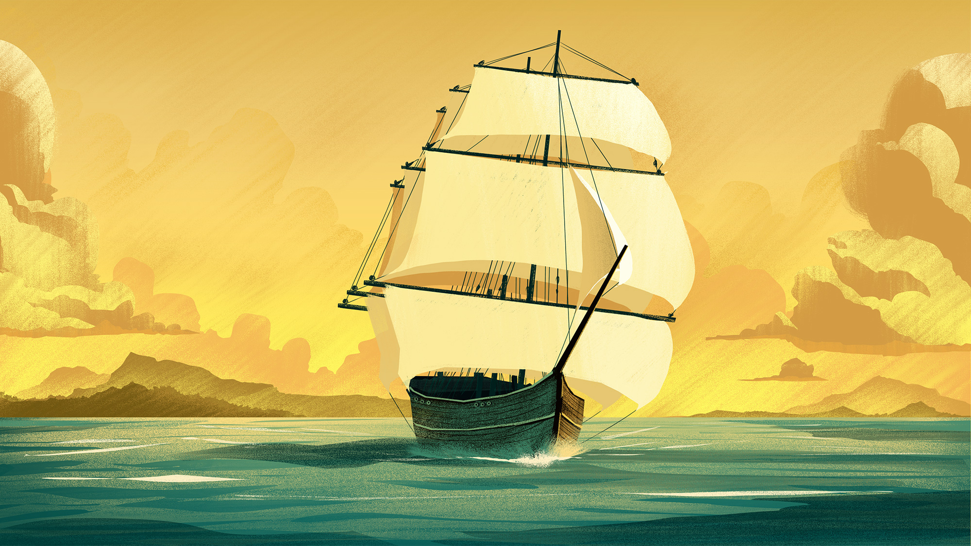
Shot 1 focuses on a ship as it sails through smooth waters. Clouds begin to encroach upon the ship as the camera moves closer and closer to the hull.
Shot 2 shows the inside cabin of the ship. Here we see the precious cargo the ship is carrying.

Shot 3 uses a color transition to show that the encroaching clouds are now upon us as thunder and lightning rock the vessel.

Shot 4 the camera lifts out of the cabin and we see a full on sea squall pounding the ship.

Shot 5 As the camera pulls back from the ship we're suddenly taken to an eerie scene underwater where we catch our first glimps of the creature lurking below.

Shot 6 The creature spins violently creating a massive whirlpool. We see ships in the distance which have been claimed by the creature as our ship rides the outskirts of the whirlpool to safety.

Shot 7 Suddenly the creature attacks!

Shot 8 Our ship evades the creature and finally pulls into the harbor of its destination. The storm dissipates and reveals a calm and beautiful evening. This was probably one of my favorite shots to work on.

Shot 9 As the ship pulls closer into the cove, we see a timelapse shot as the sunrise brings hope of a new day. This was also a personal favorite shot of mine which was actually added after the other keyframes had already been done. I thought it was a great touch and brought a nice sense of closure to the illustration series.

The other great thing about working on this project is I was able to do a few creature concepts and ship turnarounds. These would be used by the animators and modelers as reference.


Before moving to color, I produced all of the illustrations in black and white. I often do this as it helps me to focus on strong design, shape, layout, and lighting. There's something about the black and white versions that still appeals to me just as much as the color versions. It definitely brings an added sense of drama which I love.


The shot below was added during the process. I worked this one in as more of a rough concept than a polished piece and opted to bring the finished look into the finals since the overall direction of the piece was well established by this point.


Thanks for taking the time to check out my work! I'd also like to take this opportunity to announce a new website I've been working on: www.OrlinCultureShop.com I'll be adding lots of new work soon as well as a process blog where you can see all my work in greater detail. Thanks!