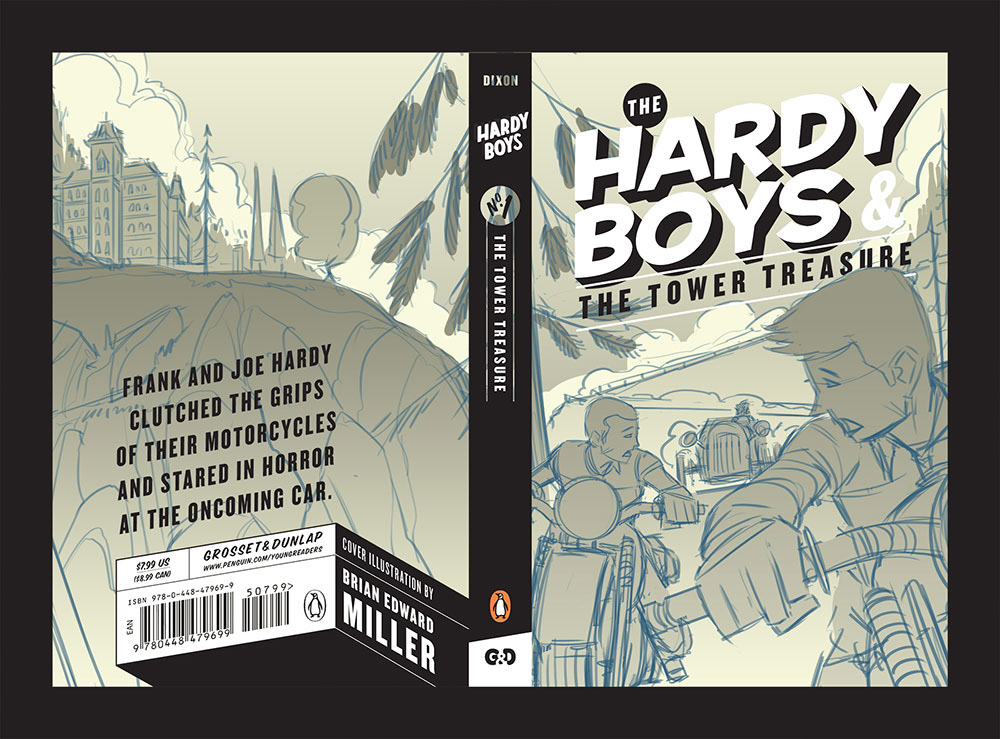
Hardy Boys Cover
2016

Cover Design by Mallory Grigg · Illustration by Brian Edward Miller of Orlin Culture Shop
While its a bit strange to be posting a project I worked on back in 2014, I am still thrilled to be able to share an illustration I did for one of the most exciting projects I've been a part of yet: a cover illustration for The Hardy Boys & The Tower Treasure. These books are rooted in so many childhood memories (including mine) so when I got the call, I was beyond excited. I worked with Mallory Grigg who sent me the brief and the stellar rework of the title treatment which had a great modern interpretation of the vintage stylings I appreciate most. Needless to say, by that point, I was chomping at the bit to get sketching!
Sketches
I sent over 3 options for the cover (front and back) with what I thought were some of the most iconic scenes in the book. If you haven't read the book yet, I won't spoil anything for you (but seriously, how have you not read this yet?). The scenes I chose made for some really fun visuals to explore while working with the placeholder typography Mallory sent me.


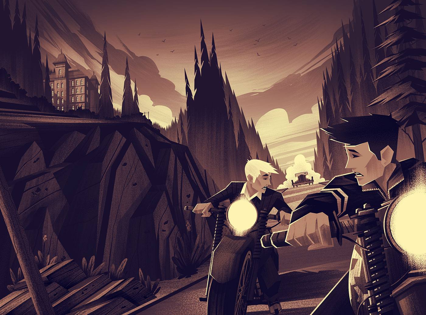
Black & White Flats
Once the sketch was approved, it was time to move onto the black and white flats. Rather than working purely in black and white, I threw a gradient map on top of the piece to give me some of the nostalgic vibes I was chasing for the piece. For me, doing little things like that helps keep the overall mood and tone in the forefront of my mind. This helps me in my decision making processes in the same way a compass helps a hiker.
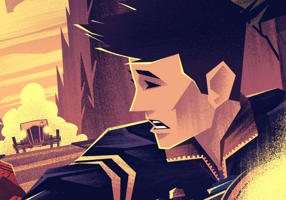
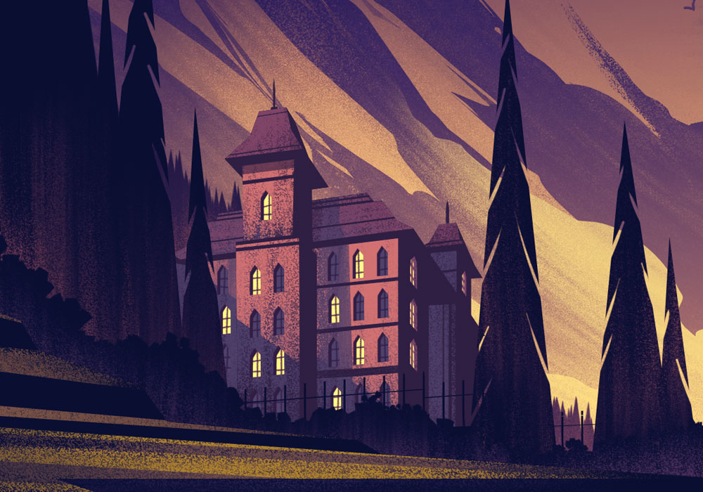
During this phase, I really wanted to give a grand feeling to an epic moment in the story. I wanted the trees to be towering, the clouds to be swirling and dramatic, and the overall mood to be one of danger and adventure. I think the tilted horizon helped with that and I was able to push a decent amount of depth into the tight space while leaving room for the title to breath.
Color
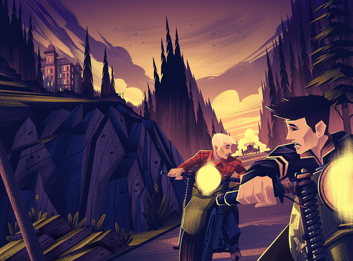
With the flats in place, it was onto color! The gradient map I used really helped set the tone and direction for the final covers. I opted to palletize the color scheme to help the cover stand out a bit on the shelves and to enhance the overall tone and feel I was chasing.
With the flats in place, it was onto color! The gradient map I used really helped set the tone and direction for the final covers. I opted to palletize the color scheme to help the cover stand out a bit on the shelves and to enhance the overall tone and feel I was chasing.
From Black & White to Color
I get a lot of questions from folks curious about my process of going from black and white to color. The short explanation is: layering! When I'm working in black and white, I fully layer each object you see. Each color gets its own layer within the object. Once its time to go to color, I simply recolor each layer by either locking the pixels and painting over it or using layer styles. Once in a while I'll simply lock the pixels of an entire object (for example, a tree) and then paint within the boundaries of that shape using whatever colors I need.
I get a lot of questions from folks curious about my process of going from black and white to color. The short explanation is: layering! When I'm working in black and white, I fully layer each object you see. Each color gets its own layer within the object. Once its time to go to color, I simply recolor each layer by either locking the pixels and painting over it or using layer styles. Once in a while I'll simply lock the pixels of an entire object (for example, a tree) and then paint within the boundaries of that shape using whatever colors I need.
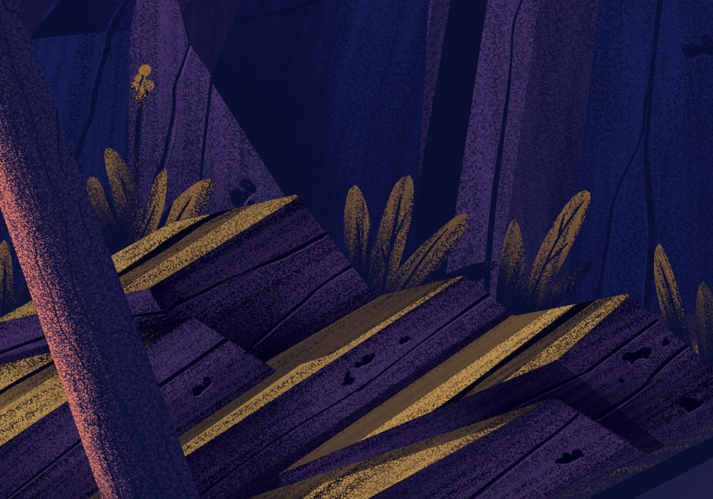
Details
I hope you enjoyed the process breakdown and the end results! I am so thankful to be able to work on projects like these. I remember being enamored with cover illustrations of my favorite books as a kid, pouring over every detail and absorbing the visuals as I read. Its my hope kids are able to do that with my illustrations as well.
Huge thanks to Mallory Grigg and the excellent team at Penguin Random House. You made one of this illustrator's dreams come true! And a big thanks to my wonderful agent, Deborah Wolfe, whose tireless efforts make all of this possible and enjoyable.
Last, but certainly not least, thank YOU for reading my post and watching what I'm working on. I truly value the comments you leave and, while I'm not able to respond to all of them here, am very thankful for them.