
Field & Stream: First Hunt
2015
There are some pairings that are just meant to go together: Peanut butter & Jelly, Beer & Burgers, Bacon & Everything. In 2014, another such pairing was made when I was given the opportunity to work with Field & Stream. Field & Stream is one of my favorite magazines and their subject matter fits right in with the things I love illustrating the most.
The story I was asked to illustrate (which you can read here: Great Family Stories ) was written by Rick Bass. As a father of children who are growing way faster than I want them too, I was very moved by Rick's story. It was inspiring and really helped get me in the right mindset to create a piece that feels as much a tribute to my daughter and I as it does to Rick and his daughter.
The Editorial Illustration Process
Thumbnails
Here is a thorough breakdown of the process I use to create editorial illustrations (or any illustration for that matter). I was given the brief by Russ Smith. My wonderful agent, Deborah Wolfe, helped lock in all the details so I was freed up to create.
After reading the story and understanding the size of the article as well as the estimated placement of the article title, I did a few sketches using my trusty Col-Erase blue & red pencils on cheap printer paper. I find cheap printer paper ideal for sketching because it prevents me from being overly concerned with wasting materials as I search for my ideas. Here are the two ideas I came up with:

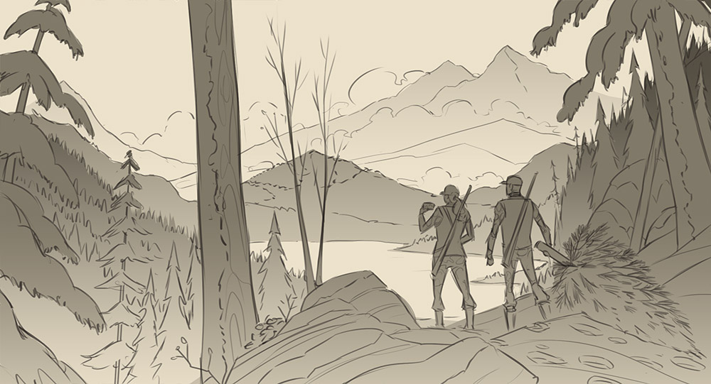
Roughs
Even though I could most likely use my thumbnail drawings to send to my clients, I like to tighten my rough sketches up in Photoshop and figure out placement of elements digitally. I always enjoy this transition from paper to digital so its a step I do more for myself. The more I enjoy the process, the better the results (usually).

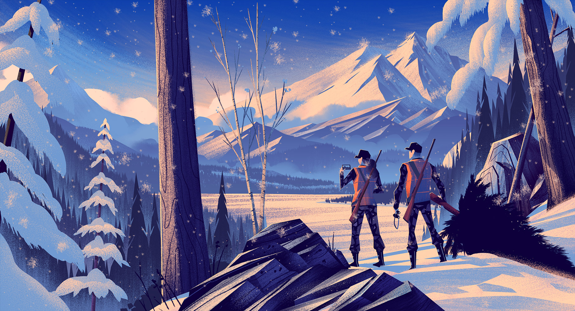
Black & White Version
Once Russ approved the sketch, it was time for me to produce the final illustration. I've enjoyed working in black and white initially as part of my process for some time because it allows me to focus on a few elements at a time: composition, lighting, texture, etc. Since I'm working 100% digitally in Photoshop, I can control the color and placement with ease, making minor adjustments as needed.

In Living Color
The black and white version helps to set the overall mood of the piece, but color is what helps draw out the tone and emotion in a more vivid way. Because color is so powerful in eliciting emotion, I like to focus on it exclusively in its own step in my process. Here are the two color options I developed for the story:


I left the final decision to Russ and with that, the illustration was completed. It was such a pleasure working on this piece in what turned out to be one of the most busy months of 2014. Thanks to Russ and the Field & Stream crew as well as my agent for working with me to create this one! I hope all of you enjoy it as much as I enjoyed creating it.