
Caddy Bar
2015

Product Shot, Courtesy of Studio Crane
2015 has been a year of firsts for me and this project makes the top of the list! I had the great fortune of working with Joe and Paddy from Studio Crane on the packaging for Caddy Wholefood Energy Bars. These energy bars target golfers (as the name implies) and gave me the opportunity to draw golf courses for what turned out to be a very fun project. You can read more about the creation of these pieces below. Lets tee off!
Sketches
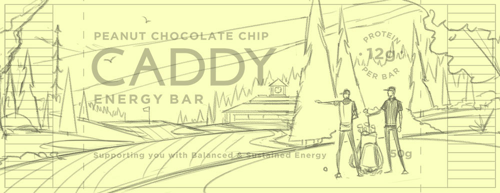
As is standard practice with all the projects I work on, we started off with sketches. One of the unique challenges in this piece was to create a single illustration which could function as the energy bar label background as well as the background for larger applications (boxes, in store displays, etc.). This meant I would need to develop scenes within the scene so that Joe and Paddy could zoom in or out of the composition to make the illustration work with their needs. After a bit of exploration, here's the sketch we landed on:

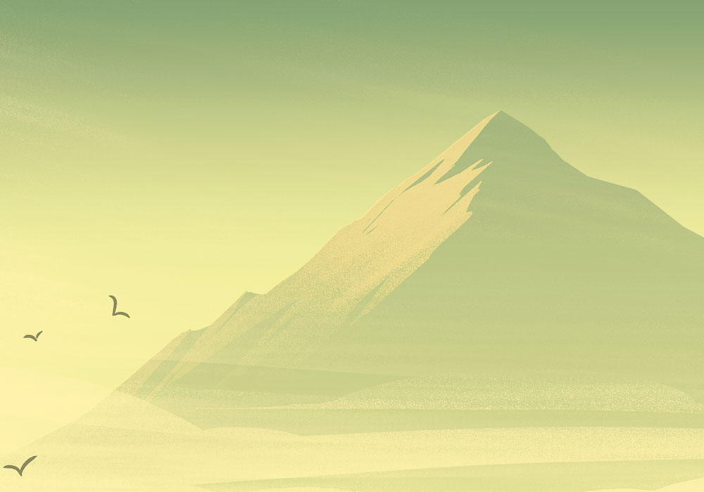
Here's a shot of the wrapper placement and where things fell with the sketch. My idea to help give the wrapper depth was to put layers of atmosphere at the foot of the mountains to give a bit of sky to the wrapper, even though technically you're looking at mountains.
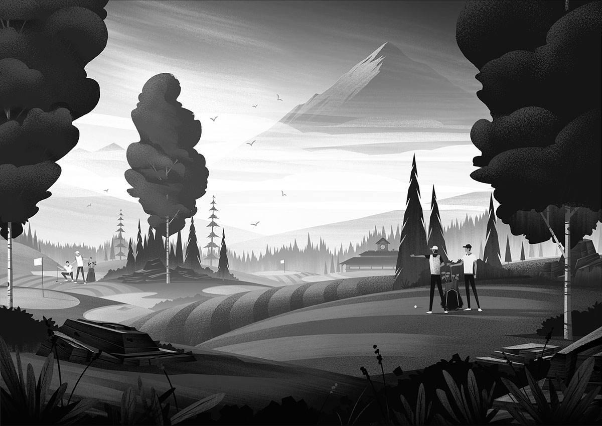
Black & White Flats
With the sketches approved and in place, it was time to move onto color. My first task was to establish strong lighting using only black and white values. This isn't a step I typically show anyone until after the project is complete, its just a step I use to focus on lighting and texture before diving into color.
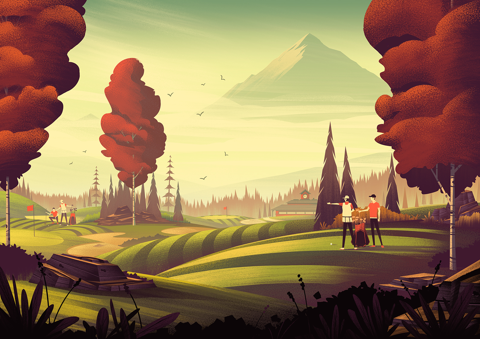
In Color
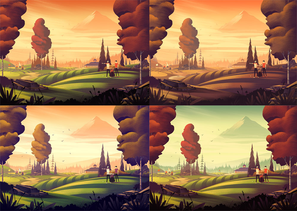
With the black and white values firmly established, its time to move onto one of my favorite parts of the process: color! The next interesting challenge with this project was to create 2 distinct color ways which would accurately represent the Caddy bar flavors (Cashew Maple Raisin & Peanut Chocolate Chip). Here are a few of the unused color explorations I did in search of the answer:
With help from Joe and Paddy and good feedback from everyone, here are the two flavor options we landed on:
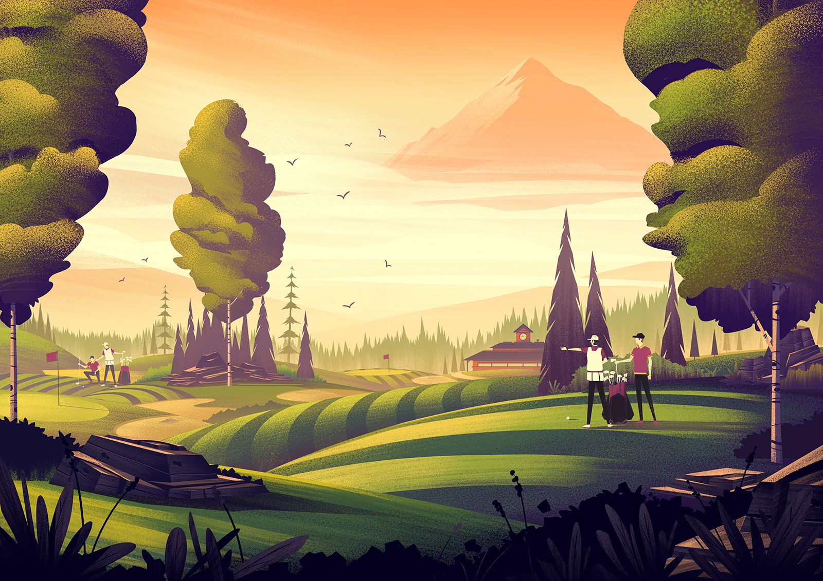
And with that, the product illustration was born! Here are a few detail shots which showcase some of the more subtle details within the piece.


Joe and Paddy provided me a few shots of the printing process which came out great and offered a unique look into the production of the packaging:

Image Courtesy of Studio Crane

Image Courtesy of Studio Crane
I expected this project to be a fun one, but its always humbling to have it turn out so well all around. Illustrating golf courses is surprisingly relaxing, even more when you have a great client like Caddy Bar and Studio Crane. I'm really pleased with the results and thankful to have done work on my first food product as an illustrator.
Big thanks to the fine folks at Caddy Bar, Joe and Paddy from Studio Crane, and my wonderful agents Deborah Wolfe and Lisa Pomerantz for their tireless efforts which make all of this possible.