
"Angels of Death"
2014
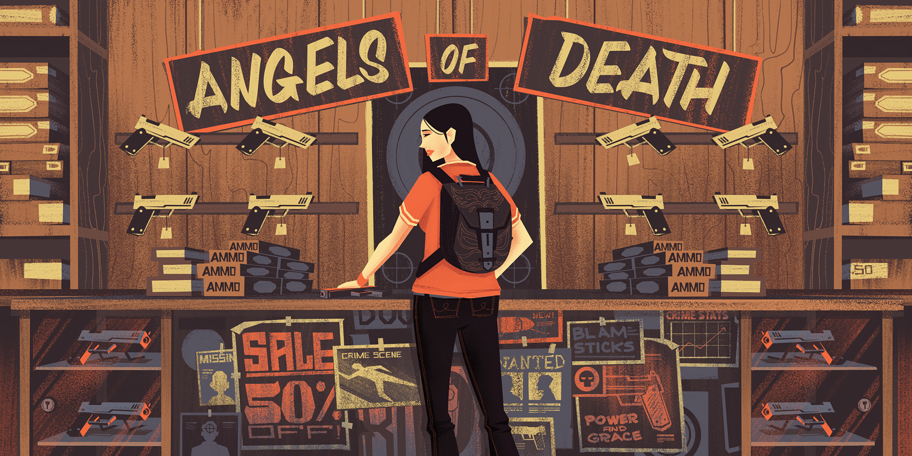
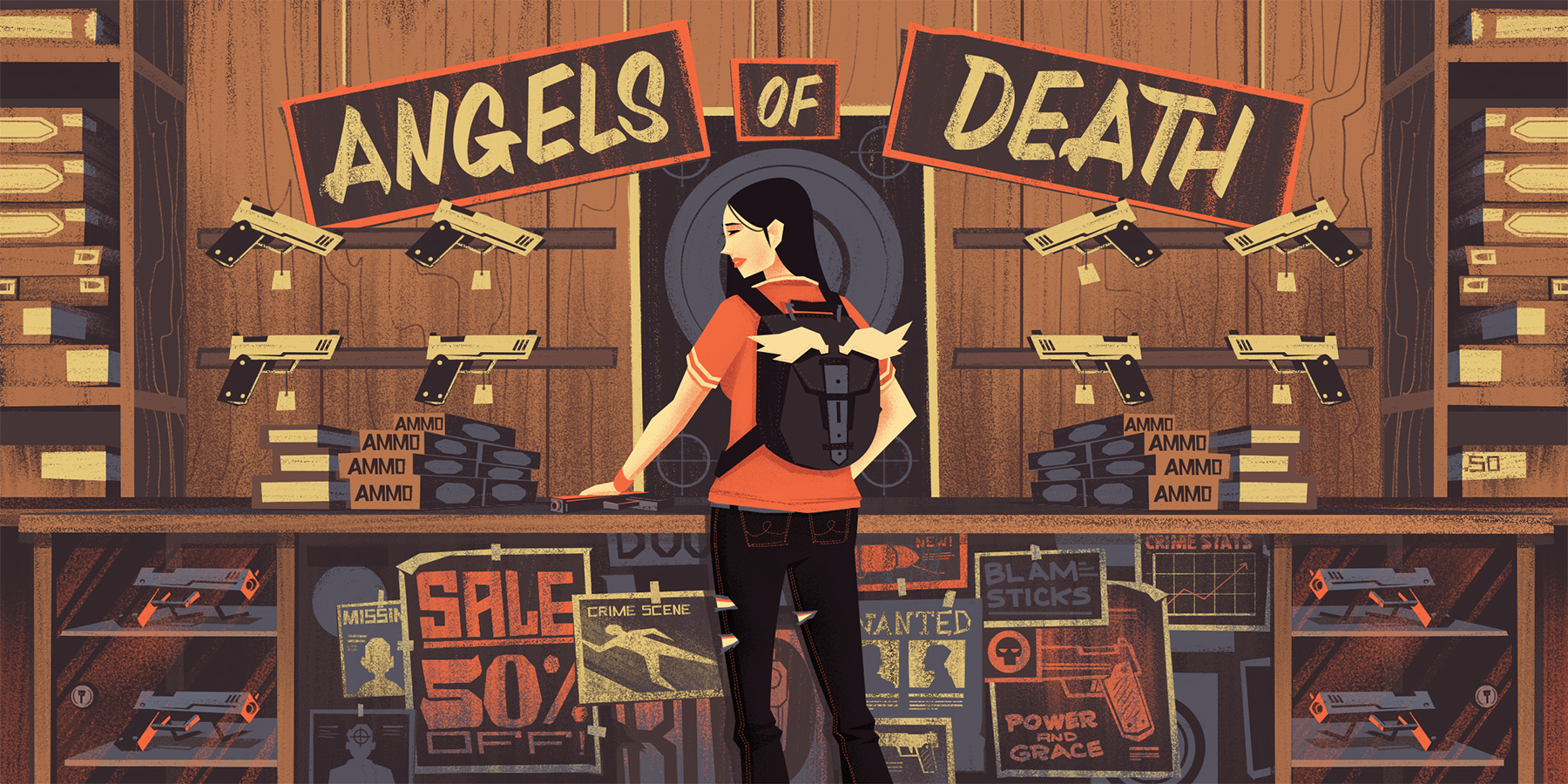
This year I had the opportunity to work with the fine folks at Contently.org on a handful of editorial illustrations. The first one we completed together was an illustration for an article titled, "Angels of Death" which is about young women who are used as straw buyers to purchase handguns, which are then fed into all sorts of unsafe places.
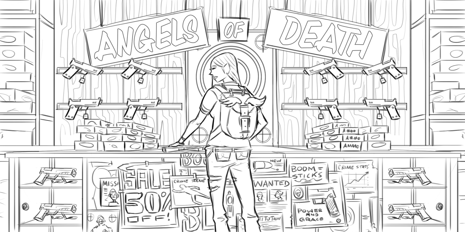
As per my typical illustration process, I presented a handful of rough sketches to get the ball rolling, and then moved onto tightened pencils, and finally color.
The biggest challenge for me personally in these kinds of illustrations is figuring out a way to visually and artistically connect with the illustration itself apart from the article or medium it accompanies. Typically this isn't difficult as a large majority of my work consists of scenic outdoor settings - something I visually connect with quite easily. However, dealing with such weighty topics as black market handgun sales and women in extremely difficult situations isn't as easy to connect to from a visual perspective.
I eventually found my inspiration in the amount of clutter and noise in my fictitious gun store. I liked the narrative created with the posters on the front face of the counter and all the visuals that formed implicit lines leading to the female character in the scene.
In the end, I'm happy with the results and thankful for the opportunity to work with the Contently crew.
The rough pencils for this one were really fun to work on because the perspective was very straightforward, which allowed me to focus on layering in lots of fun details. I liked all the visual noise in the piece that visually led to the girl being the target.
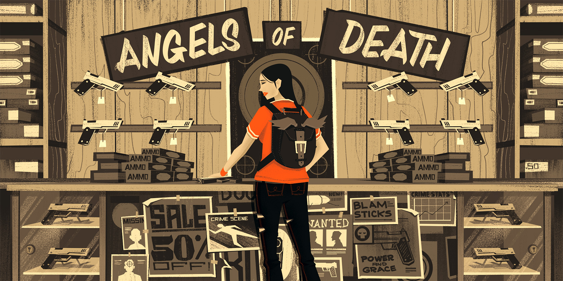
Next up, the black and white flats and textures. I threw in a red shirt on the girl just to visually remind myself that, during the final color selection, I wanted to make sure to have her stand out well.
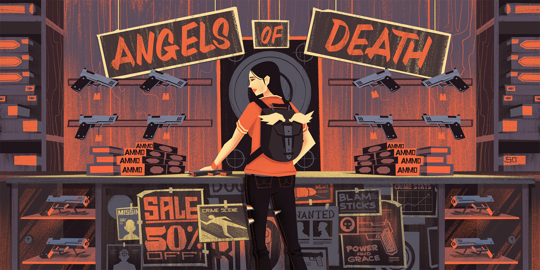
I presented 2 color options - one being a more straightforward color scheme (though still stylized) and another which pursued a more surreal color palette. Both worked for me in different ways, though the more straightforward color palette ended up being the winner.

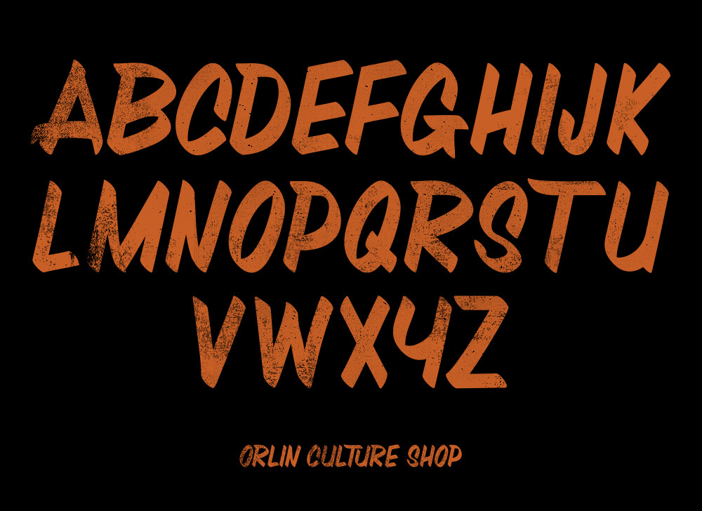
I also had a chance to use a brush font I created earlier this year for the OCS Branding.
Big thanks to the crew at Contently for the fun project - and big thanks to my agent, Deborah Wolfe, for everything she does to help!!